Role & Team:
Sole Graphic Designer, contracted directly by Creative Spark / Front Porch Communities. Collaborated with Creative Spark’s Senior Director and Program Manager, alongside a contracted Business Strategist, Instructional Designer, and Web Designer.
Overview
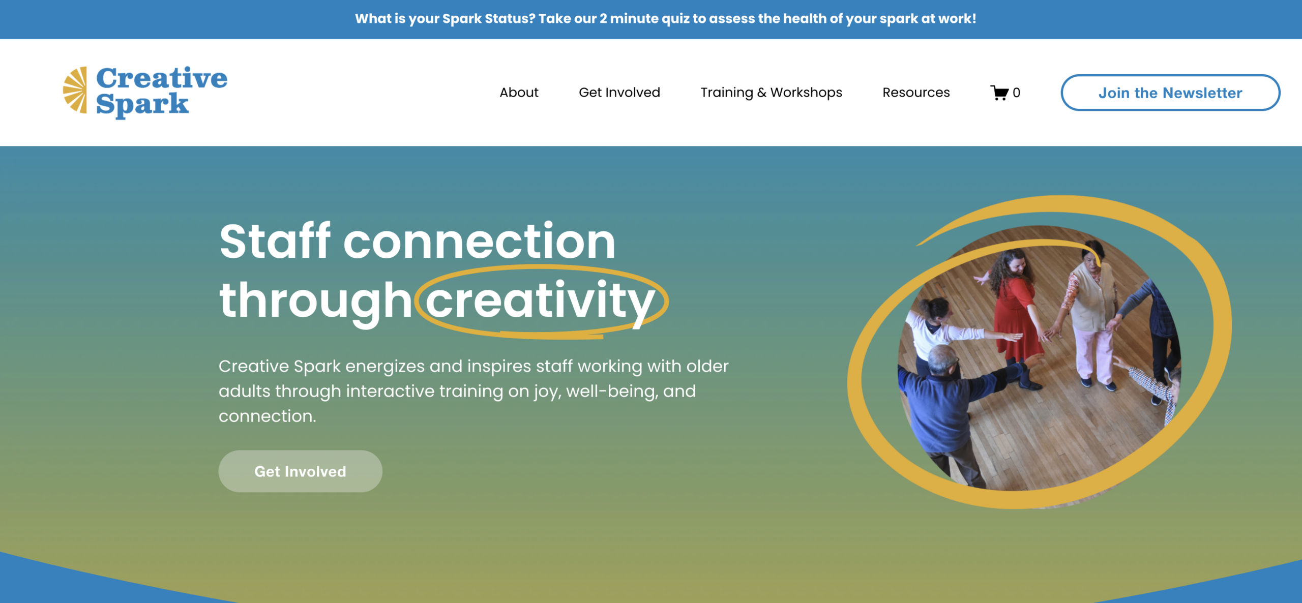
I contracted with Creative Spark to create a distinct brand identity, motion design, and digital/print collateral for an e-learning platform and updated website. Creative Spark’s mission is to energize and inspire staff working with older adults through interactive training on joy, well-being, and connection. As a community services program under its parent company, Front Porch, it was important to maintain Front Porch’s existing branding while letting Creative Spark stand out as its own creative program, with a look that felt as joyful as the training itself.
Process
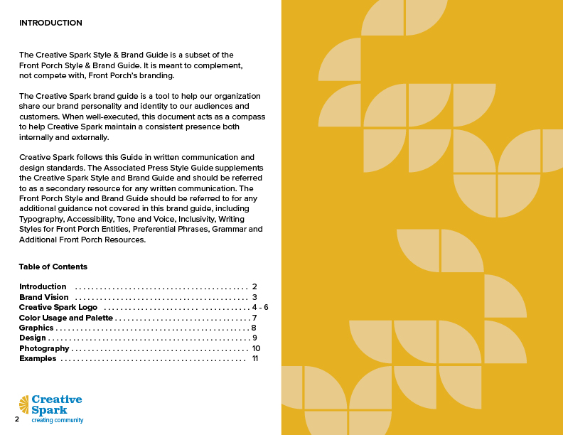
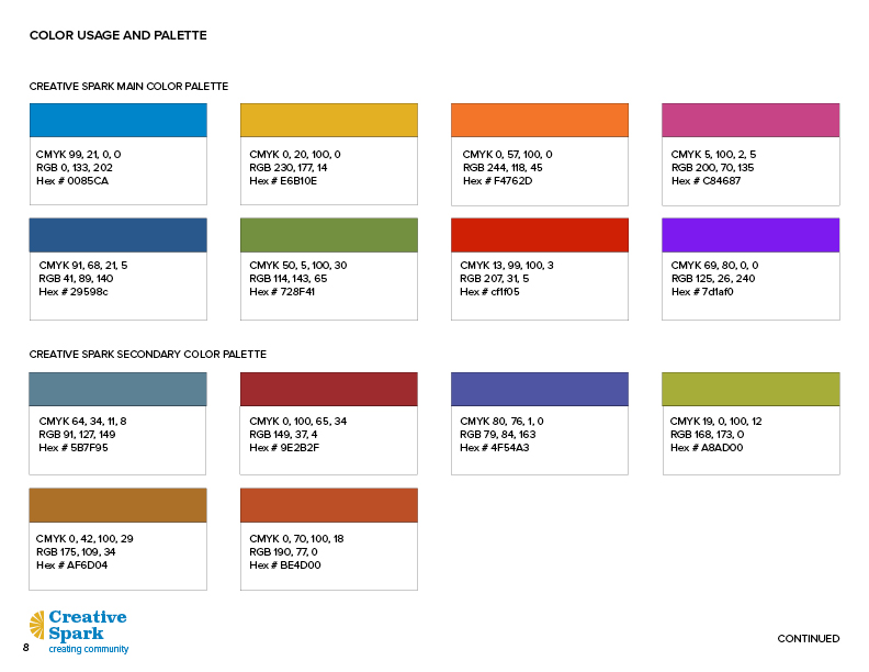
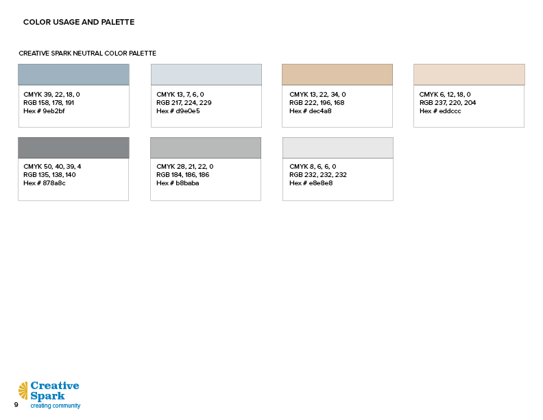
I started with the color palette, typography, logo, and a supporting graphics library. Working within Front Porch’s existing brand guidelines, I proposed flipping the hierarchy, using Front Porch’s brighter, friendlier secondary colors as Creative Spark’s primary palette, and Front Porch’s main colors as Creative Spark’s secondary palette, which the Creative Spark team approved as the direction. Front Porch’s existing typography carried over unchanged, keeping the two programs visually connected.

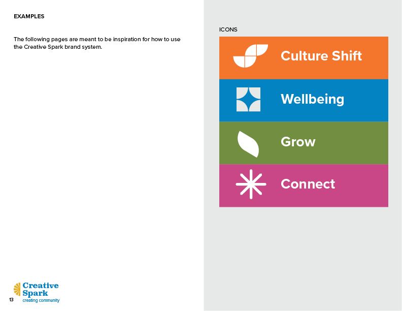
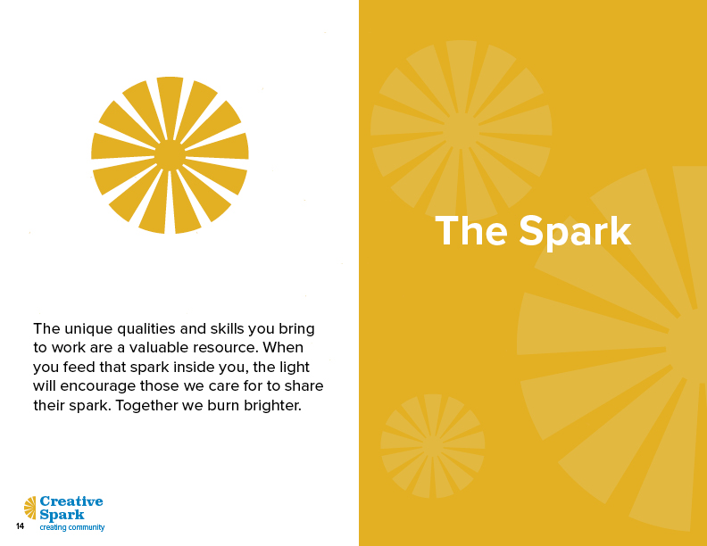
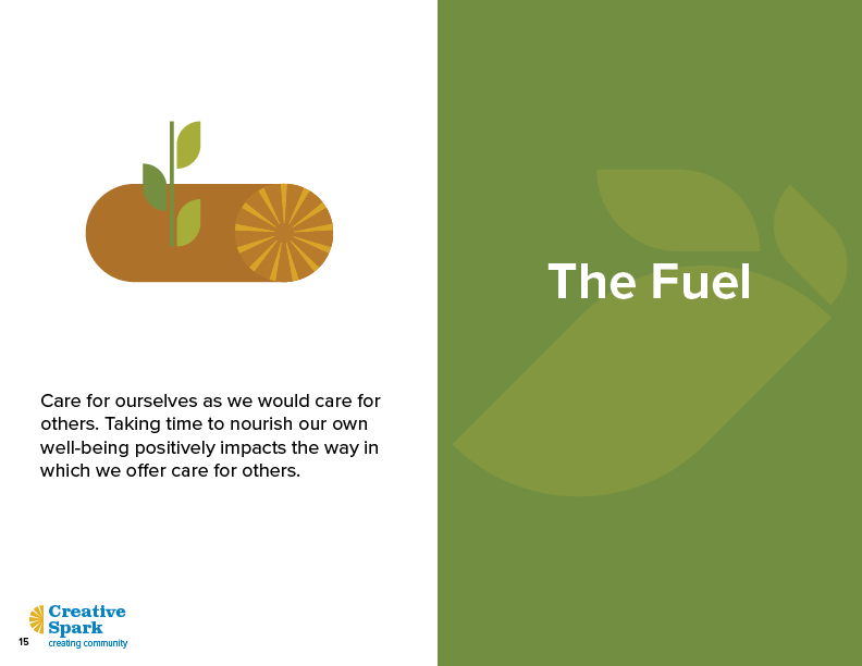
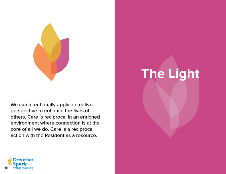
Graphics Library
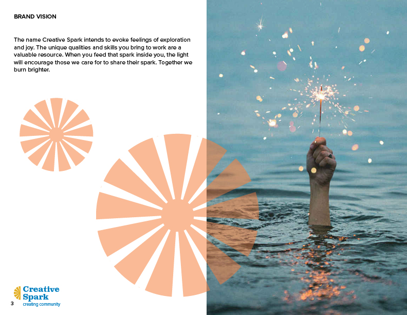
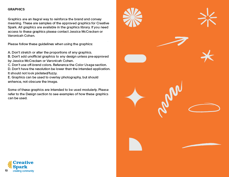
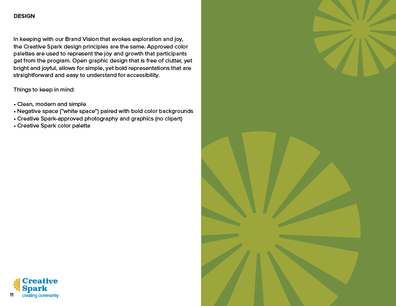
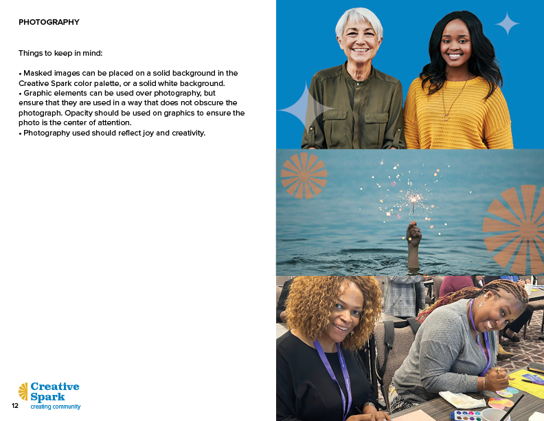
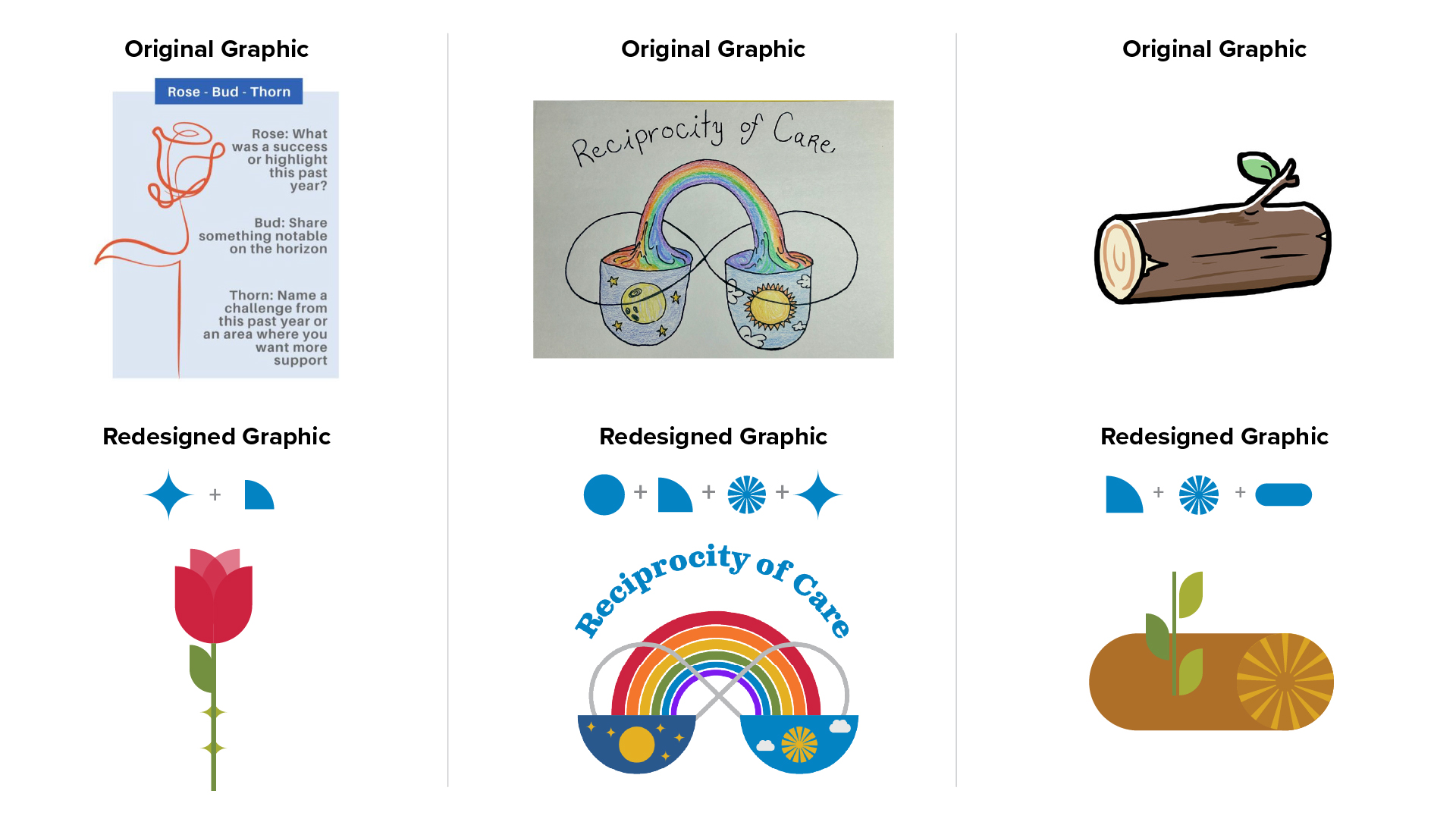
I created a graphics library designed to work modularly, with two distinct visual styles. The first is a clean, retro-inspired modular system built from simple shapes that combine into more complex images, versatile enough for both instructional content and more polished, presentation-style materials. The second has a hand-drawn look, used for outward-facing pieces or anywhere a more artistic touch was called for.
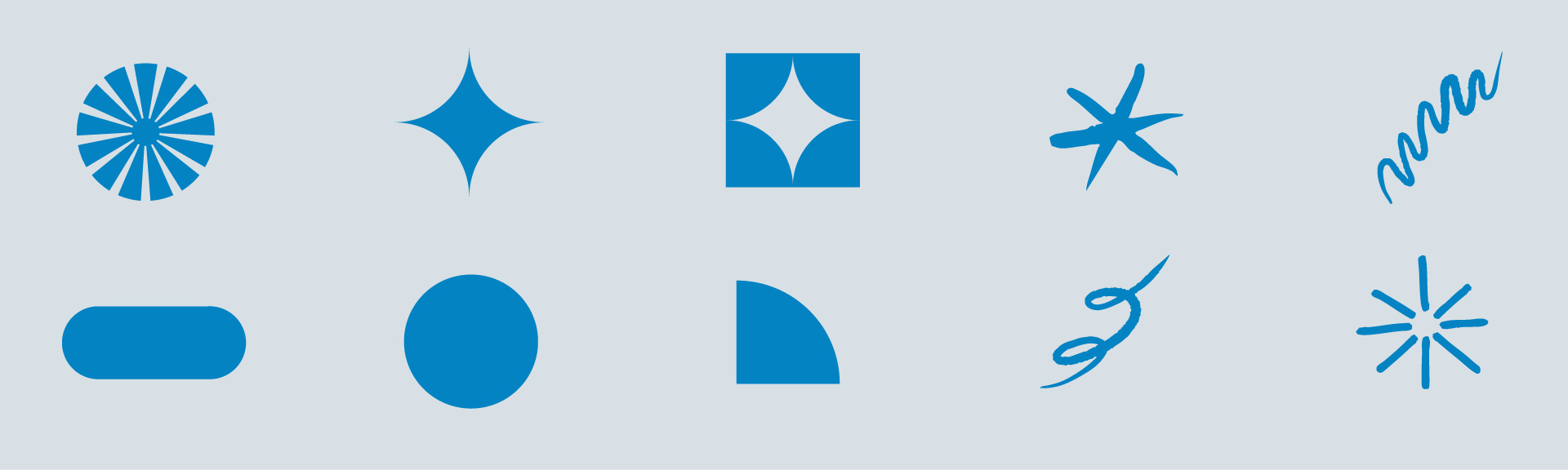
Below are some examples of the modular graphics being used to redesign existing clip art or hand drawn art to match the new branding.
Logo
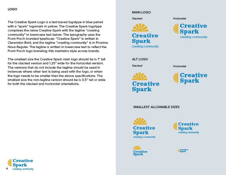
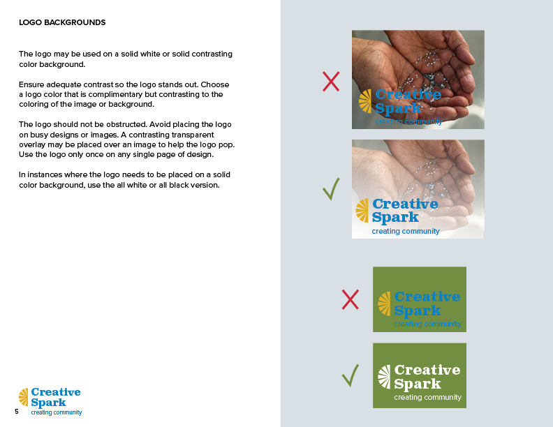
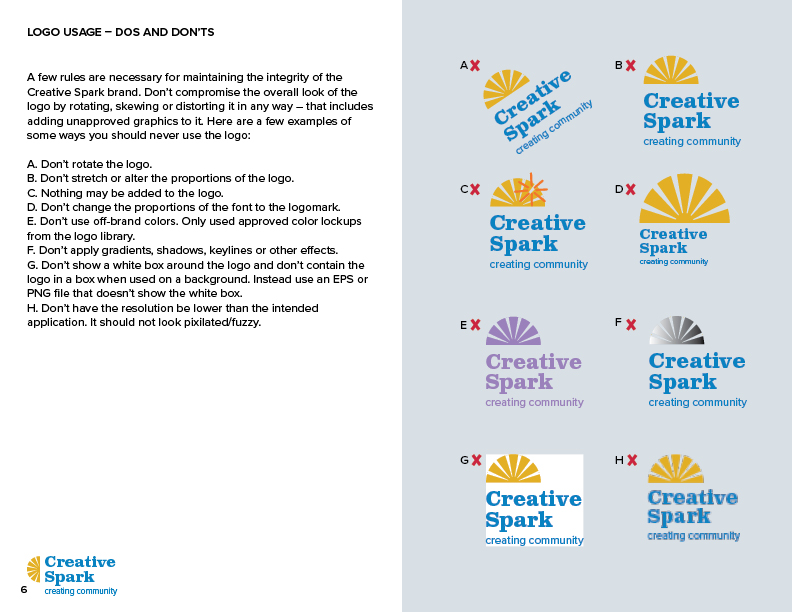
With a quick turnaround needed for the logo itself, I built it as a direct extension of the branding system. Creative Spark had responded strongly to the sun/starburst shape in the graphics library, so I built the mark around that shape and set it in Front Porch’s existing typography, landing fully aligned with the rest of the identity in a single pass, rather than as a separate design exercise. I then created an animated version of the logo for use in video and other applications.

Illustration
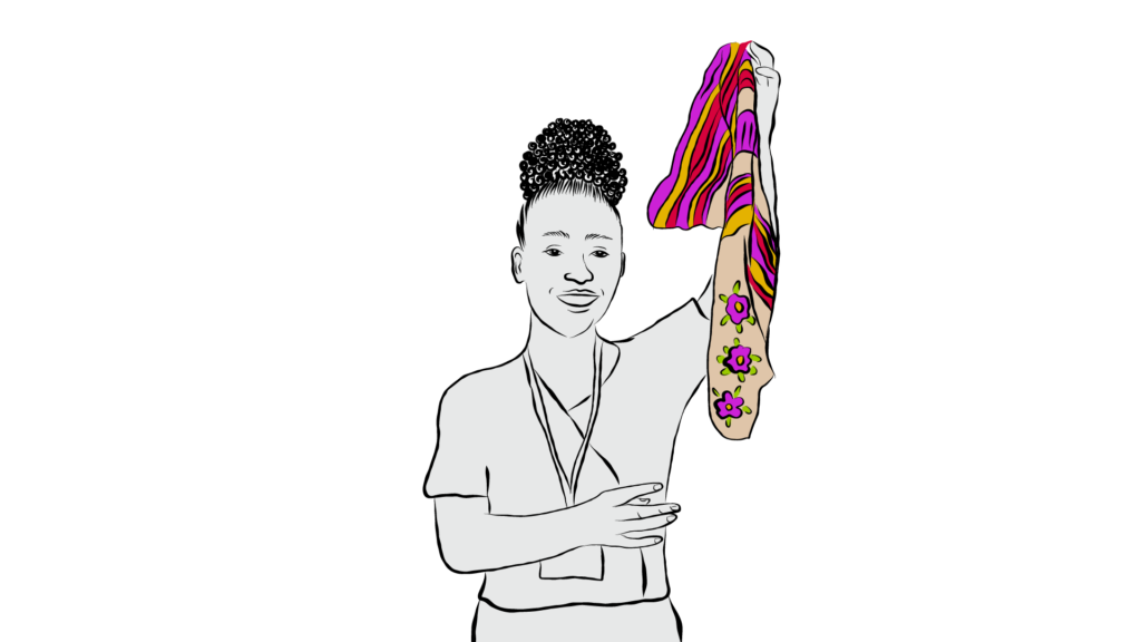
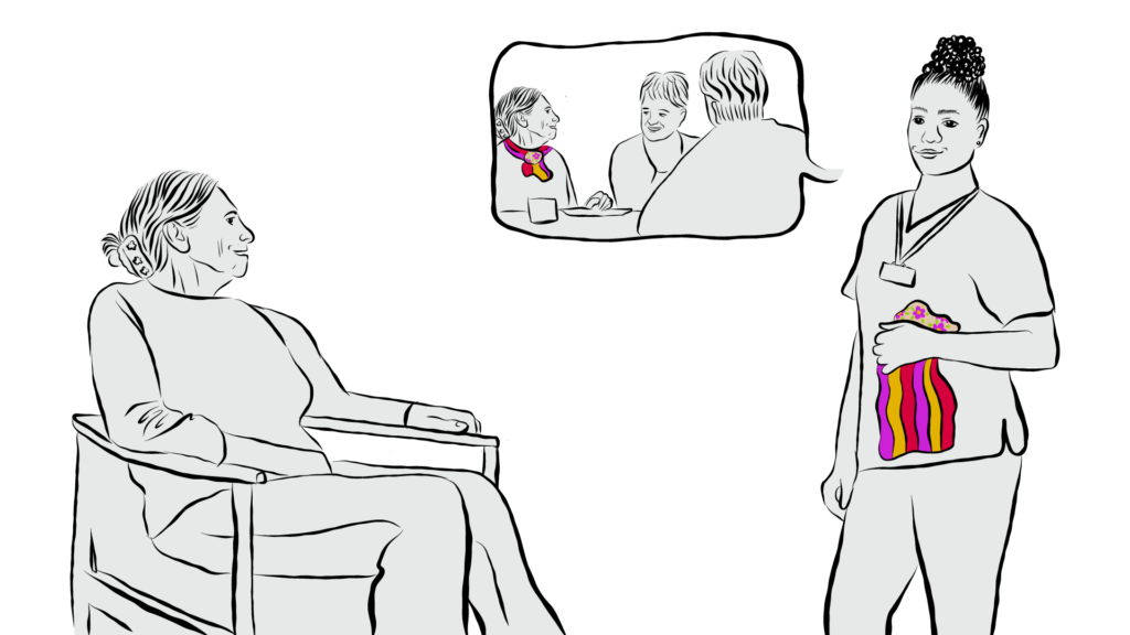
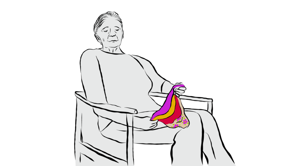
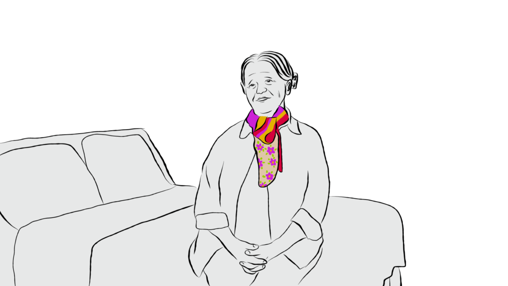
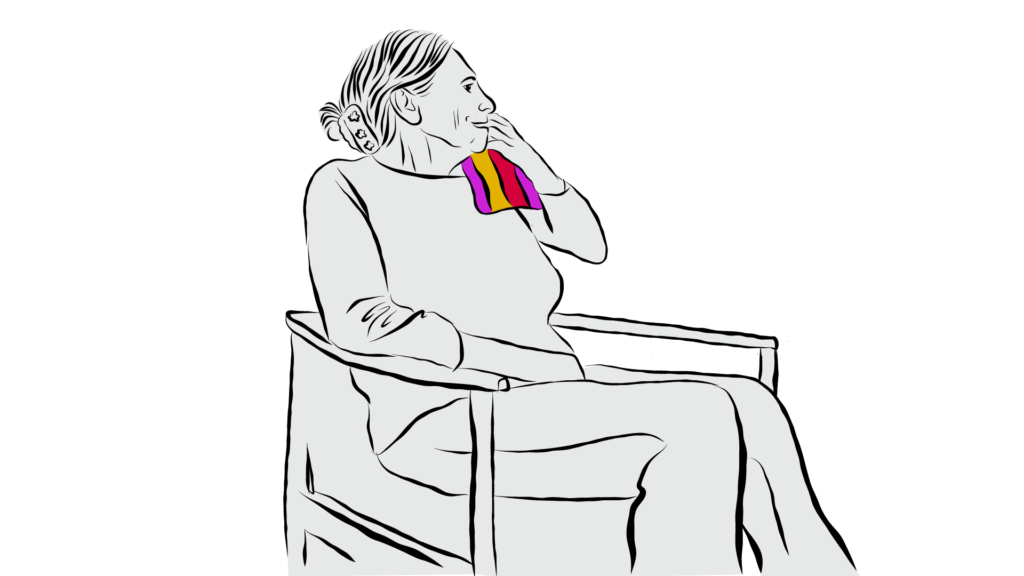
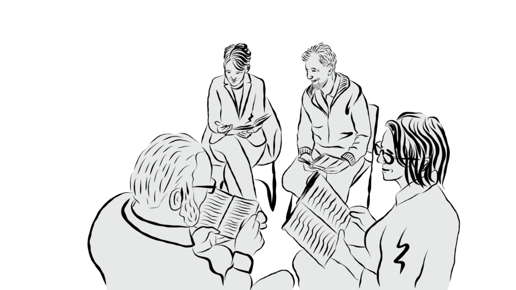
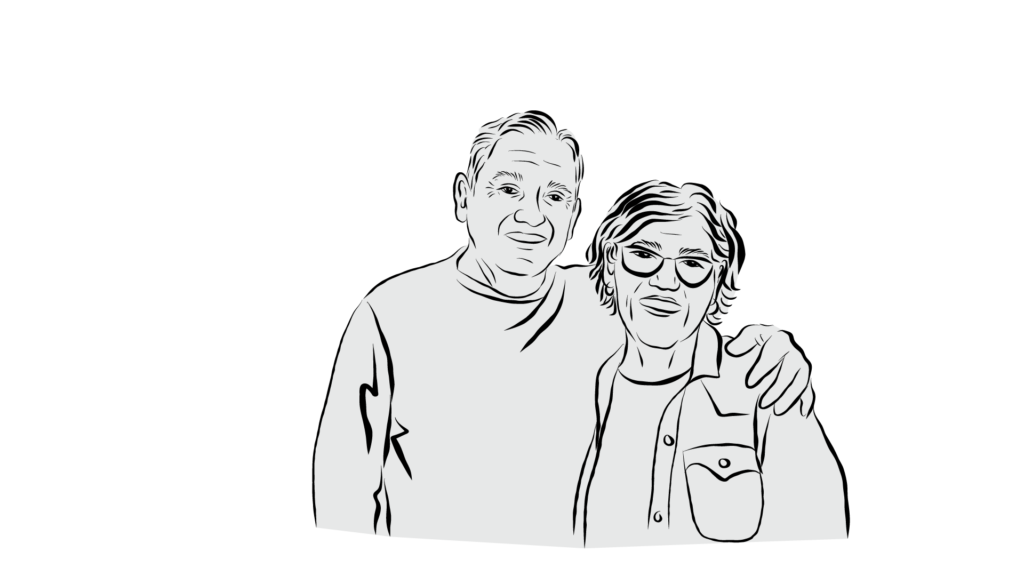
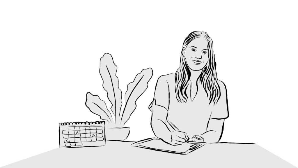
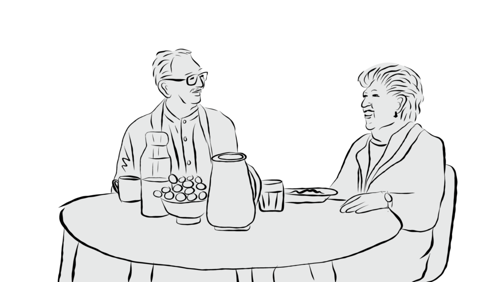
I illustrated portrait-style graphics of researchers and theorists referenced throughout the training curriculum, as well as illustrations for a video titled “Points of Contact”, to visually anchor their ideas for learners moving through the course.




Motion Graphics
I created a series of animated videos for the e-learning platform to explain key concepts from the training. These included introductory videos for each section (3 sections total), Creative Aging History (see illustrations above), Points of Contact (see illustrations above), Creative Aging Principles Defined, and 6 meditation videos.


Printed Learning Materials
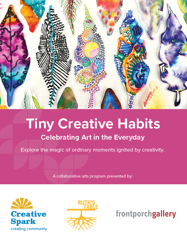
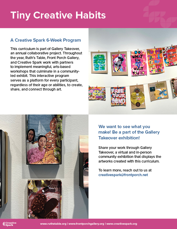
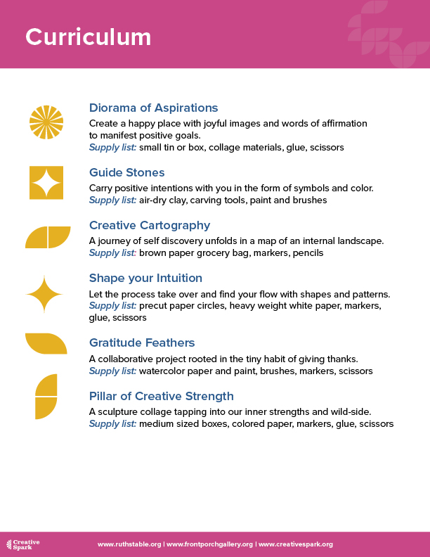
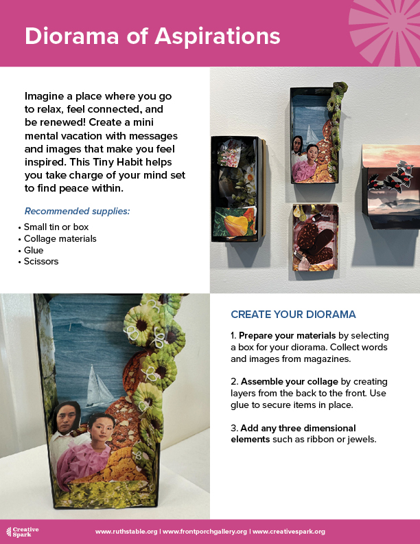
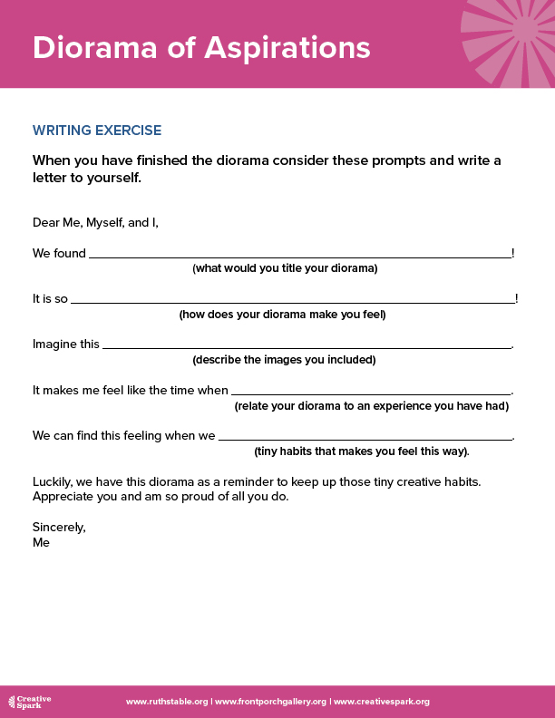
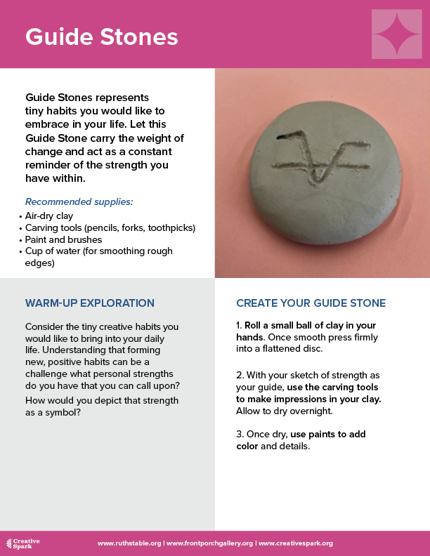
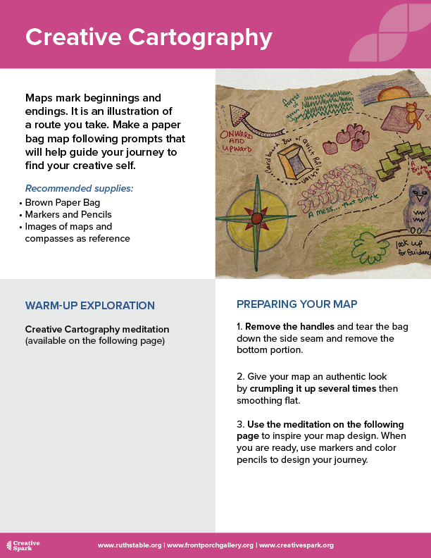
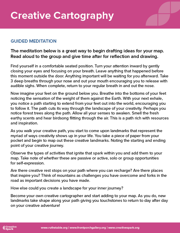
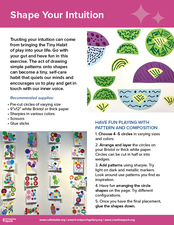
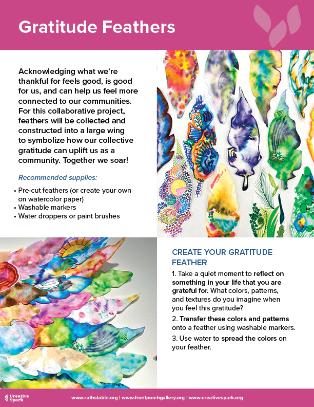
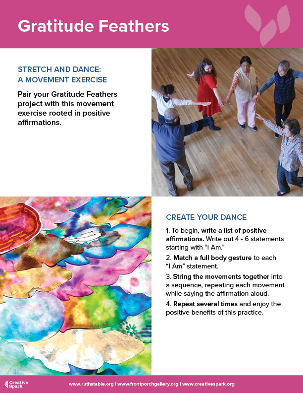
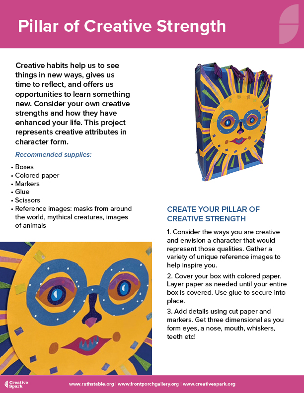
I updated the printed learning materials, including the “Tiny Creative Habits” booklet below, to reflect the new branding and create a consistent look across all training collateral.