Role & Team:
Sole Designer, contracted directly by the California Community Living Network (CCLN)
Overview
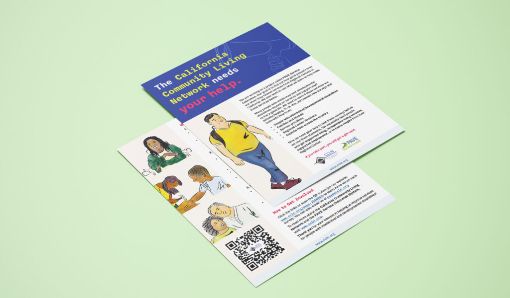
I was contracted by CCLN to create a branding system, illustrations, an explainer video, and marketing materials for the PAVE Service Outcomes Project, a new initiative to improve quality-of-life outcomes for people with developmental disabilities and their families across California. CCLN and PAVE both had existing logos they weren’t looking to replace, so the brief was to develop a refreshed look and feel that represented the people PAVE serves with dignity, while encouraging participation and engagement.
Process
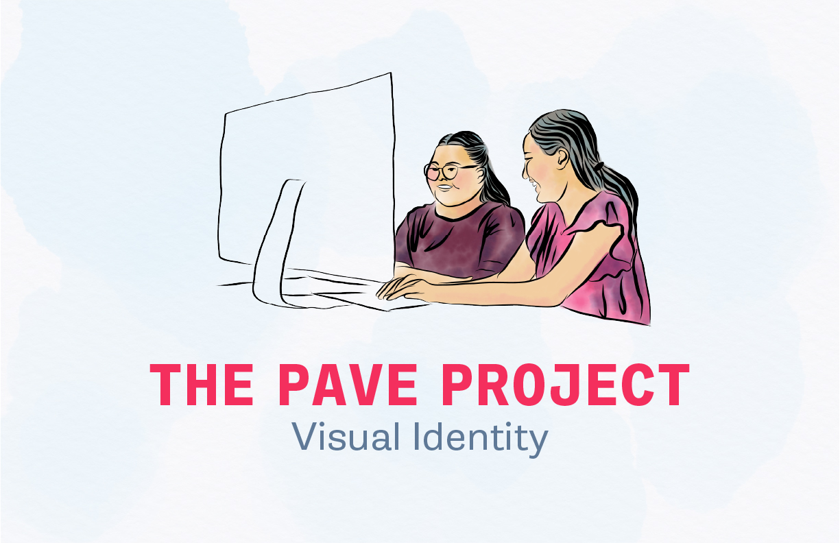
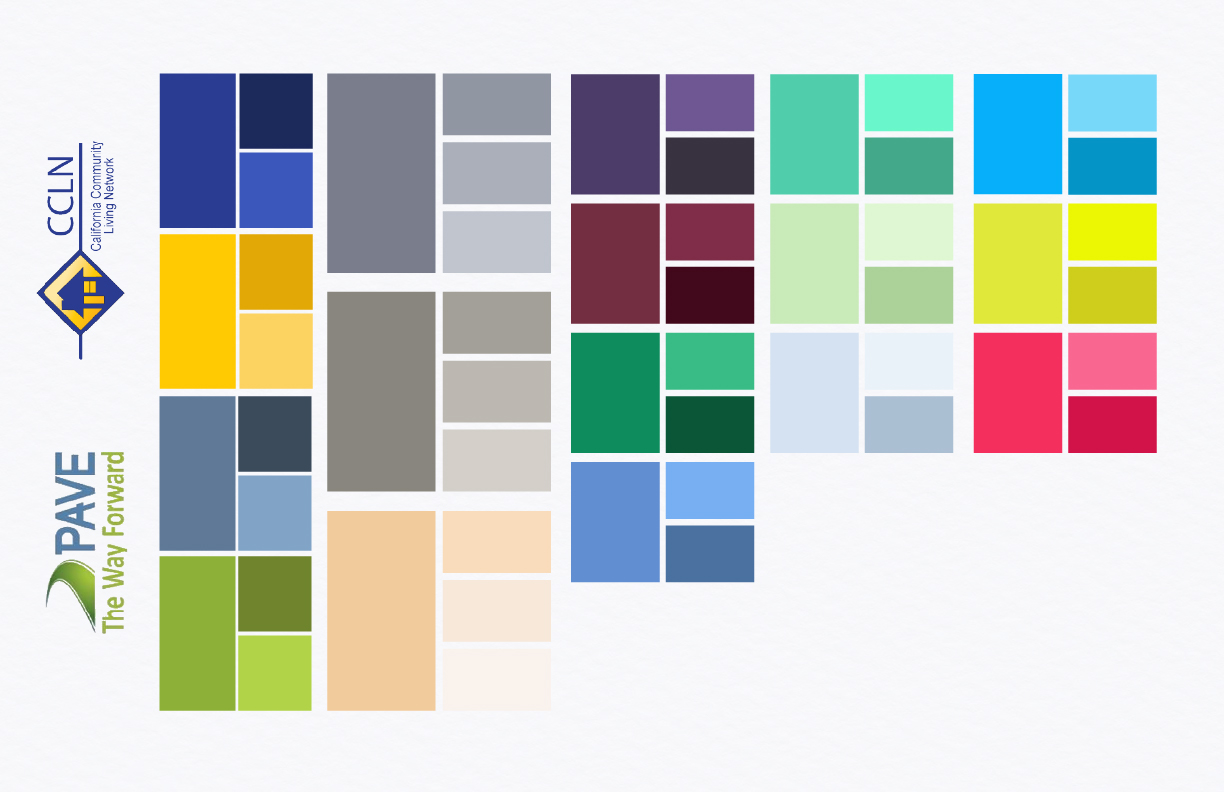
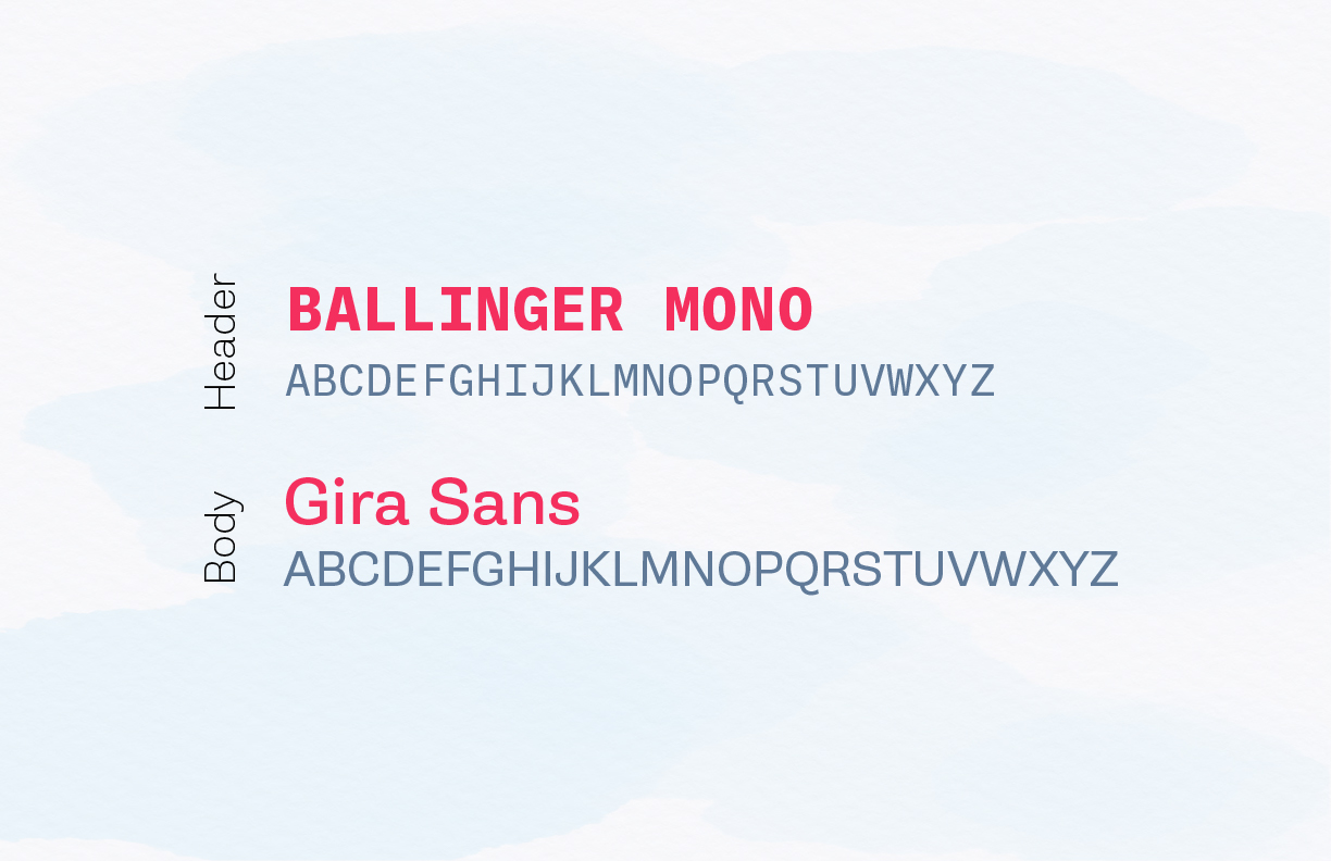
I built an expanded color palette from the existing logos’ core colors, then added neutrals, complementary colors, pastels, and brights suited to more detailed illustration and video use. From there, I developed the typography — Ballinger Mono for headers, Gira Sans for body, both friendly, modern, and easy to read — and a watercolor-based illustration style to add a human touch, all grounded in the brief’s goals: friendly, accessible, forward-thinking, and people-oriented.
Illustration
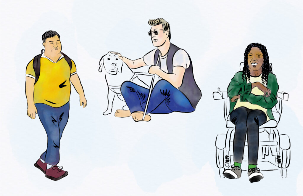
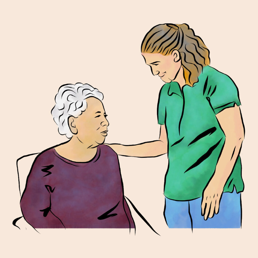
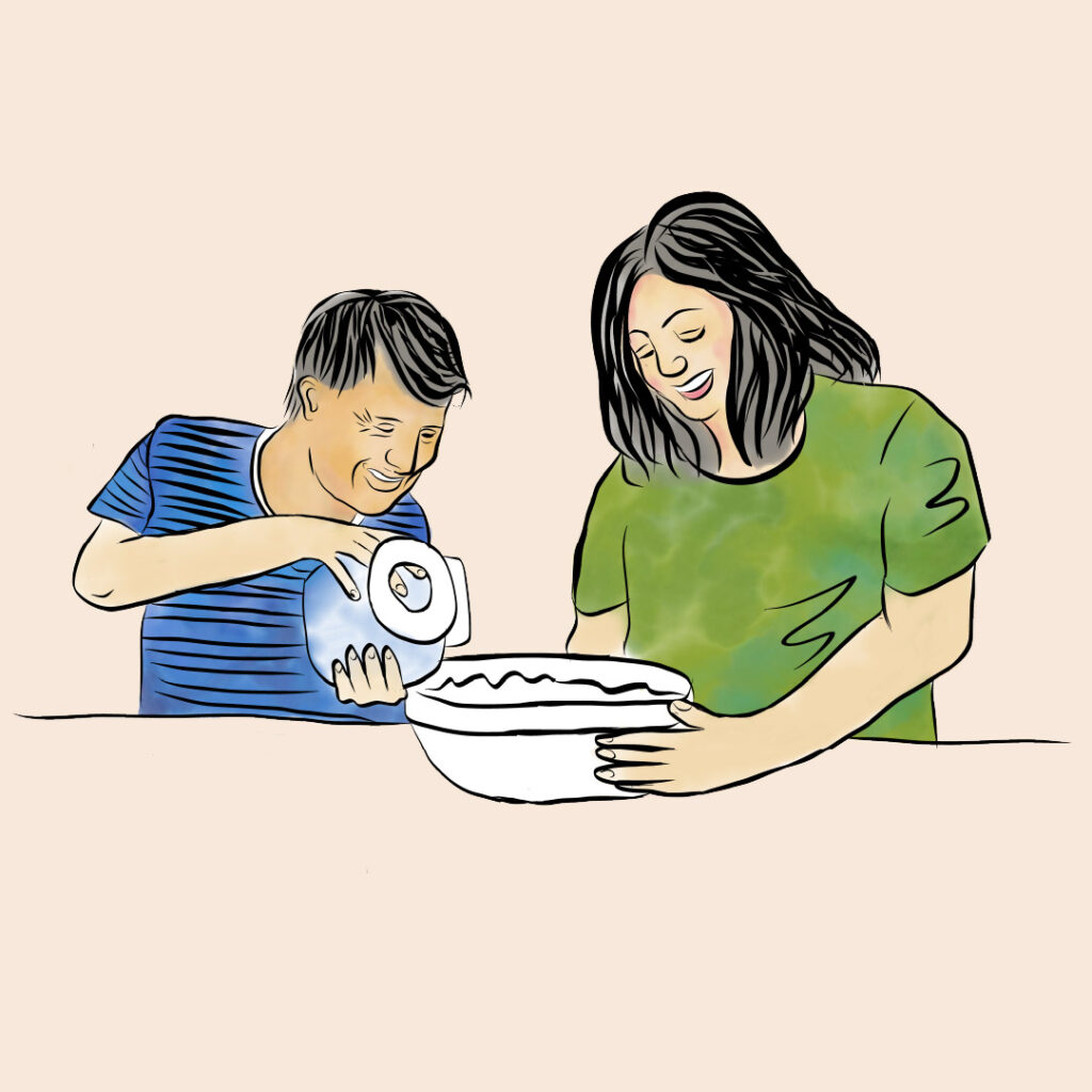
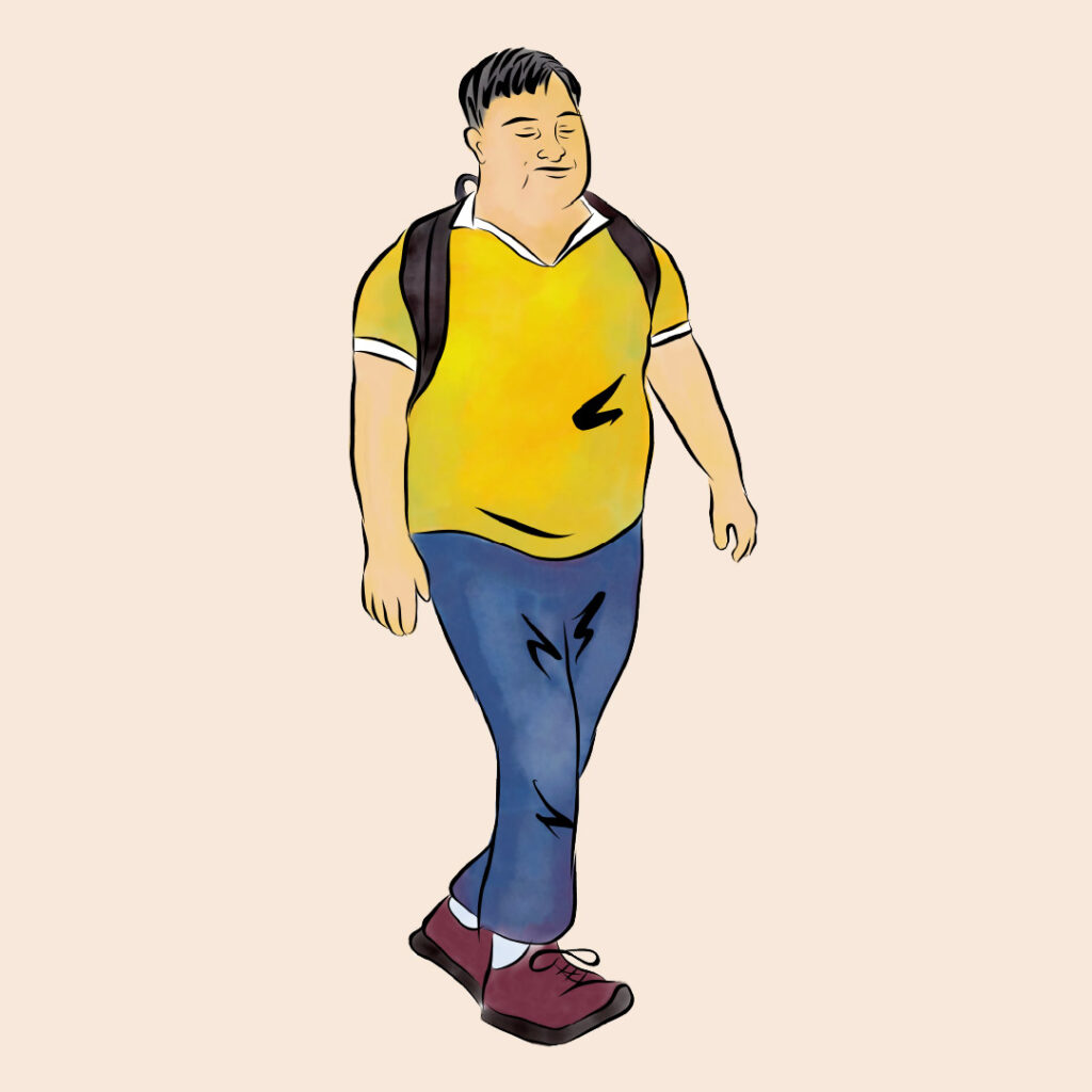
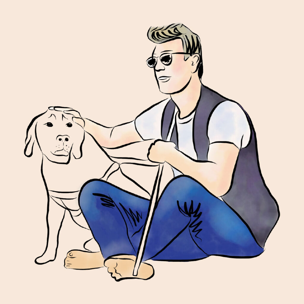
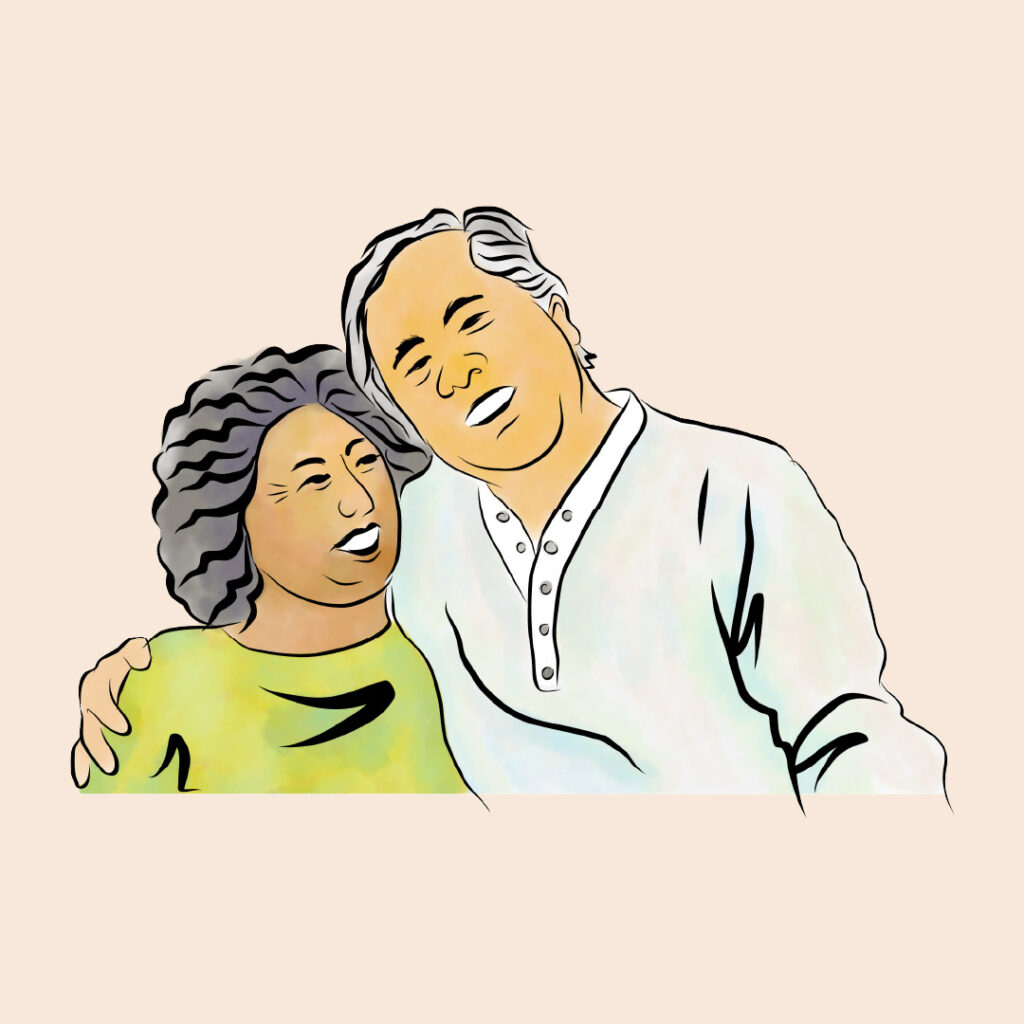
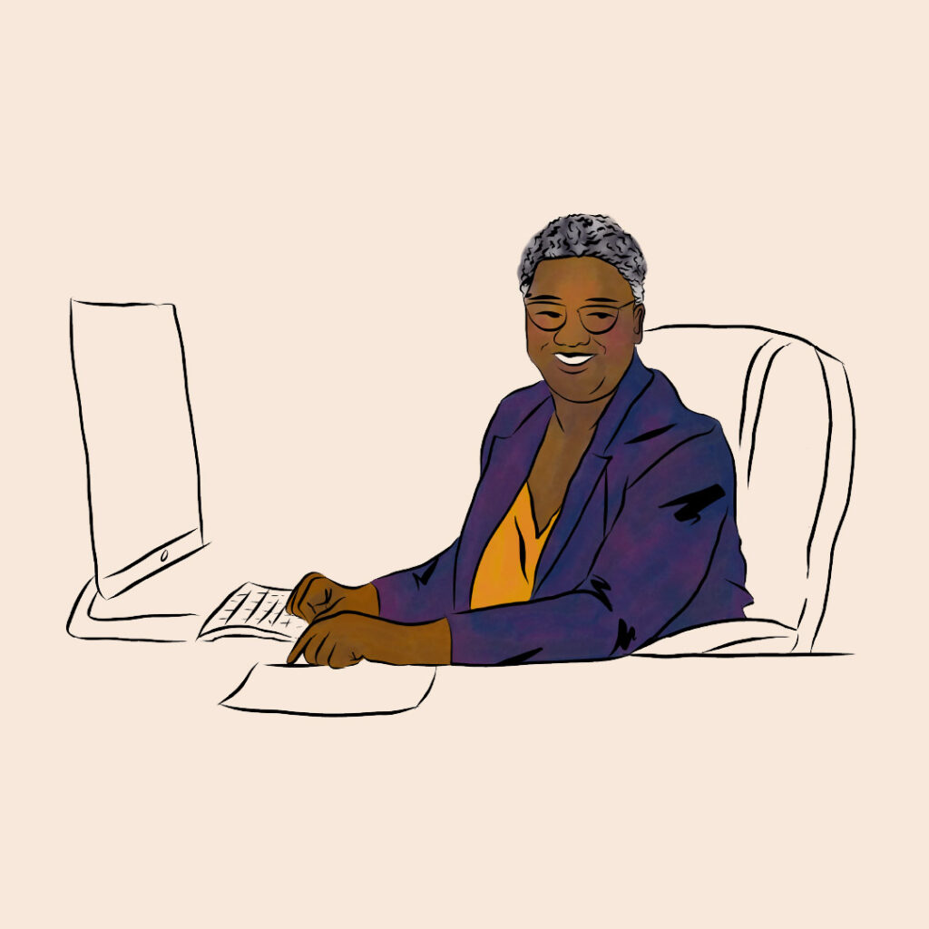
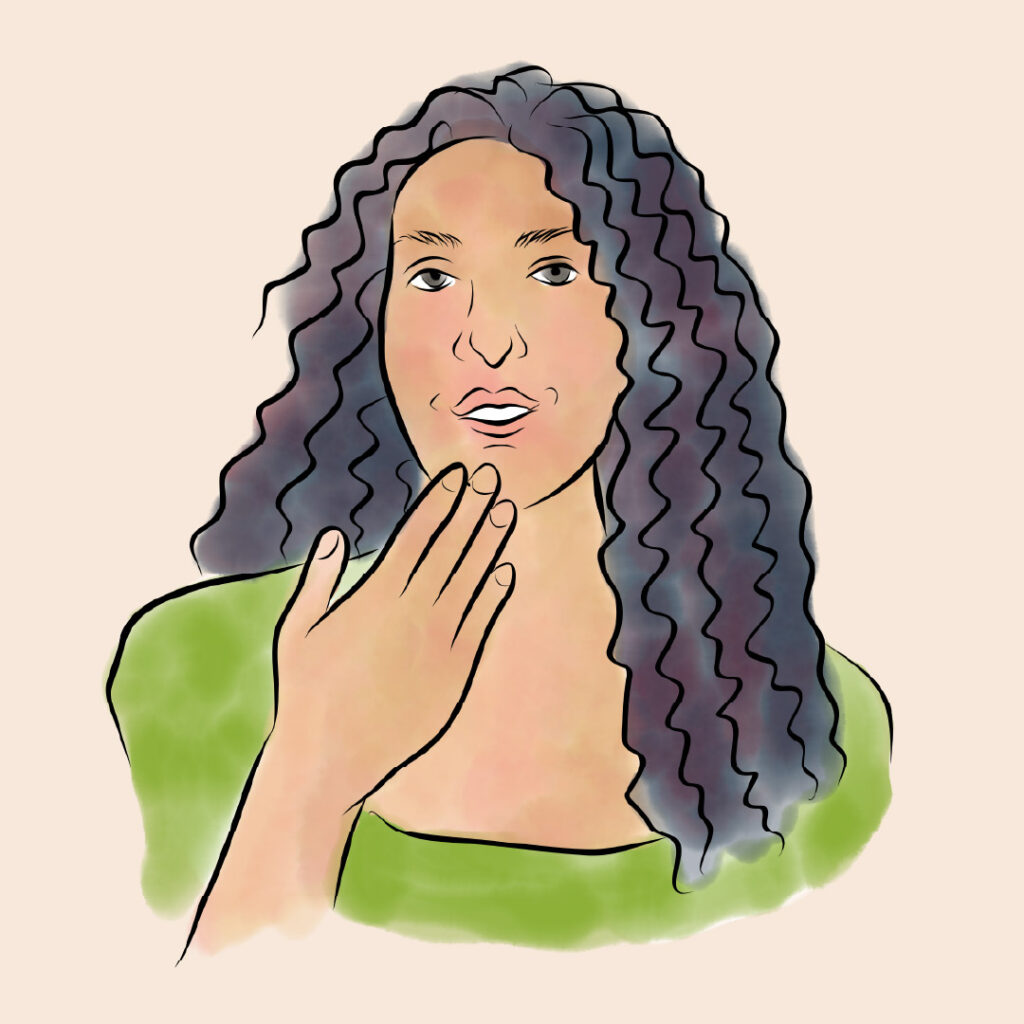
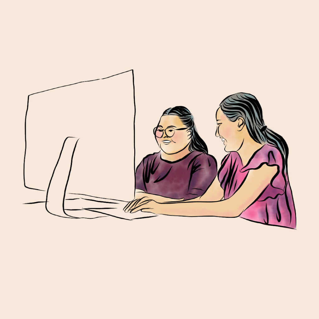
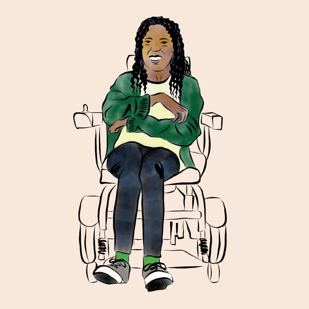
The illustration style is clean and watercolor-based, and drawn in Adobe Fresco. It depicts people realistically but with minimal detail. Where adaptive equipment or service animals appear, the person is rendered in full color while the equipment isn’t, keeping the focus on the individual rather than the disability.
Motion Graphics
CCLN also needed a video explaining the PAVE Service Outcomes Project. Given a quick turnaround, I used simple animation and graphics that wouldn’t be too time-consuming to build into a 4-minute video, while still complementing the watercolor style of the static illustrations.
Marketing Materials
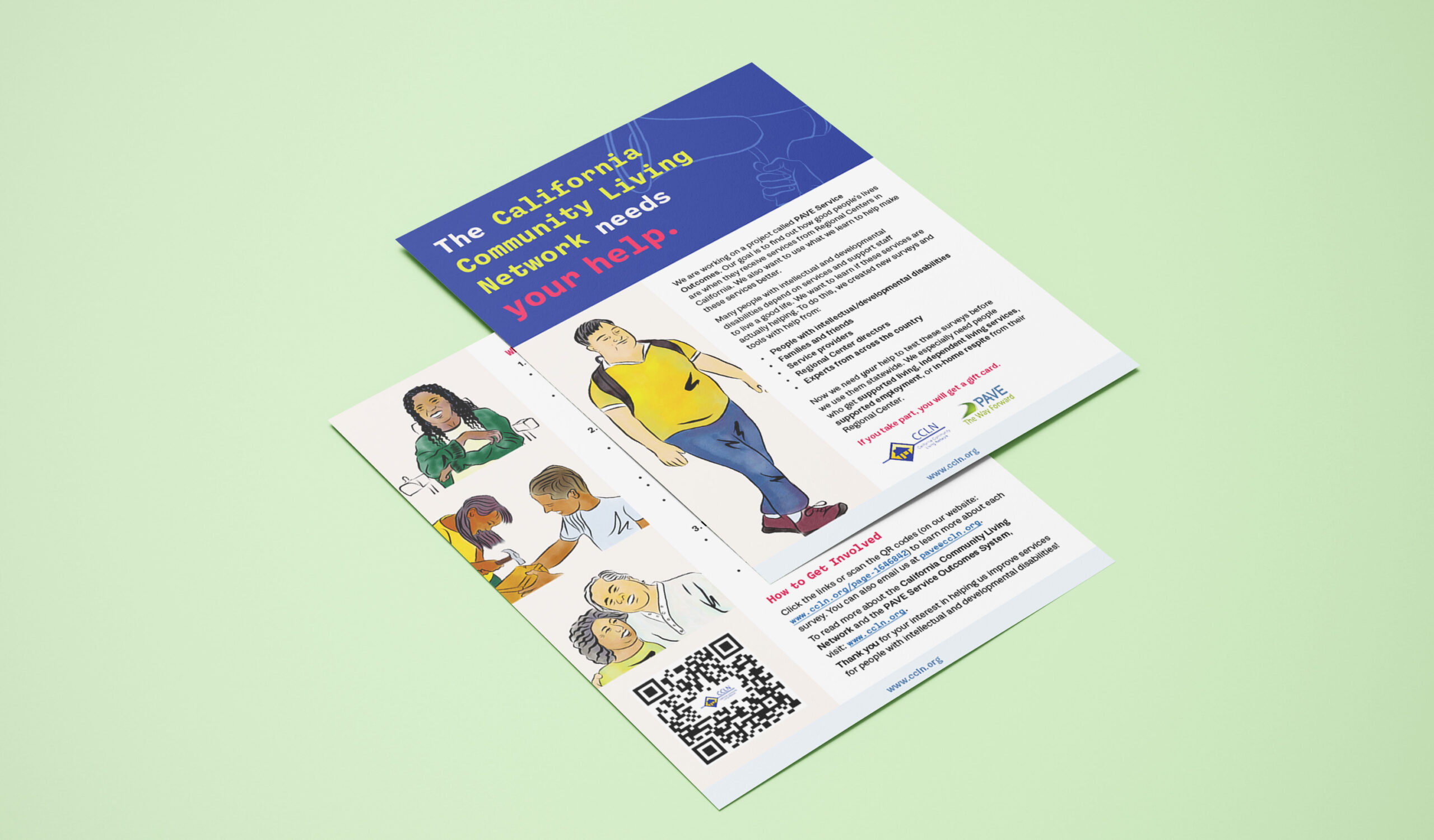
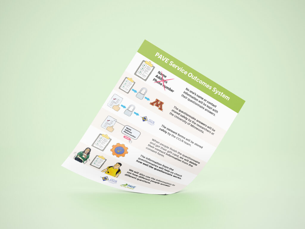
I also created an easy-read document to help people with disabilities understand what PAVE is, along with a recruitment announcement inviting individuals to complete a questionnaire.