
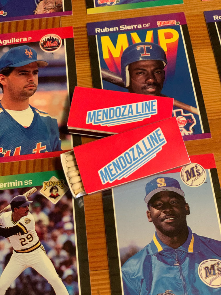
OVERVIEW
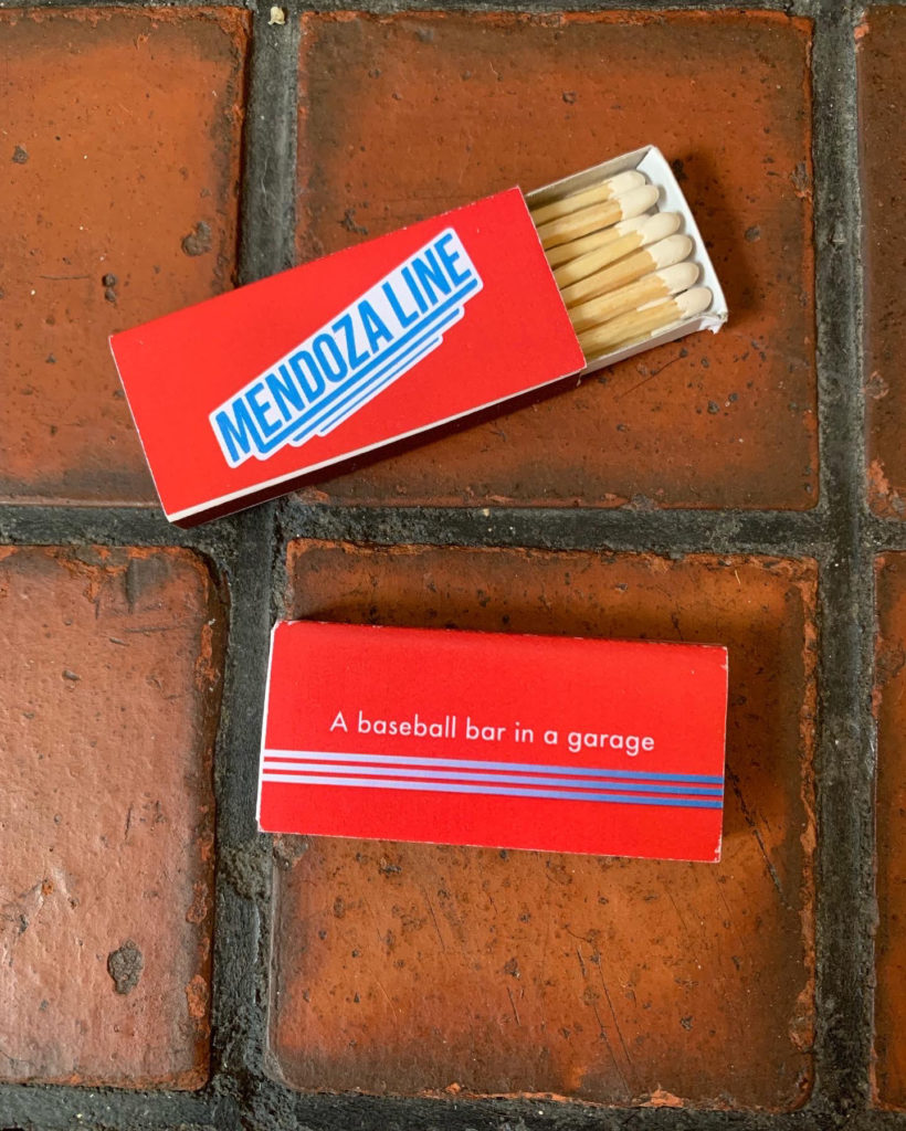
I designed a logo and branding patterns for The Mendoza Line, “A baseball bar in a garage.” The bar’s aesthetic is 90’s baseball cards, in particular the Rated Rookie brand. To start, I researched the Rated Rookie baseball trading cards, the logo, and 90’s patterns and aesthetics.
TYPOGRAPHY & BRANDING
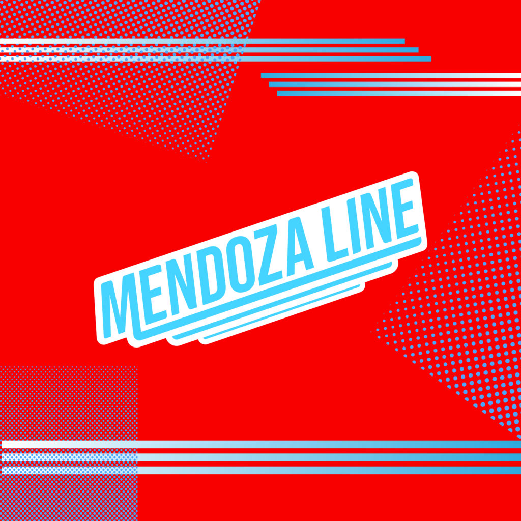
The client really wanted to lean into the aesthetic of early 90’s baseball cards specifically from the Rated Rookie brand. For the logo we went with a look and feel inspired by the Rated Rookie logo but opted for rounded edges, updated typography and cleaner lines. I chose three very “baseball” colors, bright red, light blue, and white. I also created a halftone pattern and a gradient bar pattern that could be used interchangeably as the client saw fit.