OVERVIEW
I design and animate an ongoing series of explainer videos with the Stanford Graduate School of Business to that use motion graphics to distill complex business ideas into short videos that provide a quick and easy-to-understand explanation of the idea being covered.


PROCESS
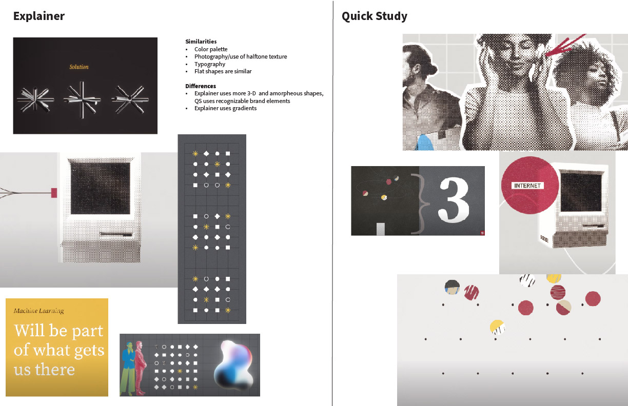
The first step as a team was to compare the existing explainer videos that had been created by an external design group against a similar series of GSB videos called Quick Study. The goal was to bring the production of the Explainer video series in-house and to create a look and feel that was similar to the original videos but different enough from the design style of the Quick Study series (which had a similar look and feel to the original Explainer series). As a team we each came up with mood boards to explore different looks and feels. Below are examples of the original Explainer and Quick Study boards that I used as reference to ensure a through-line in design while at the same time differentiating the new series to have their own look and feel.
SOLUTION
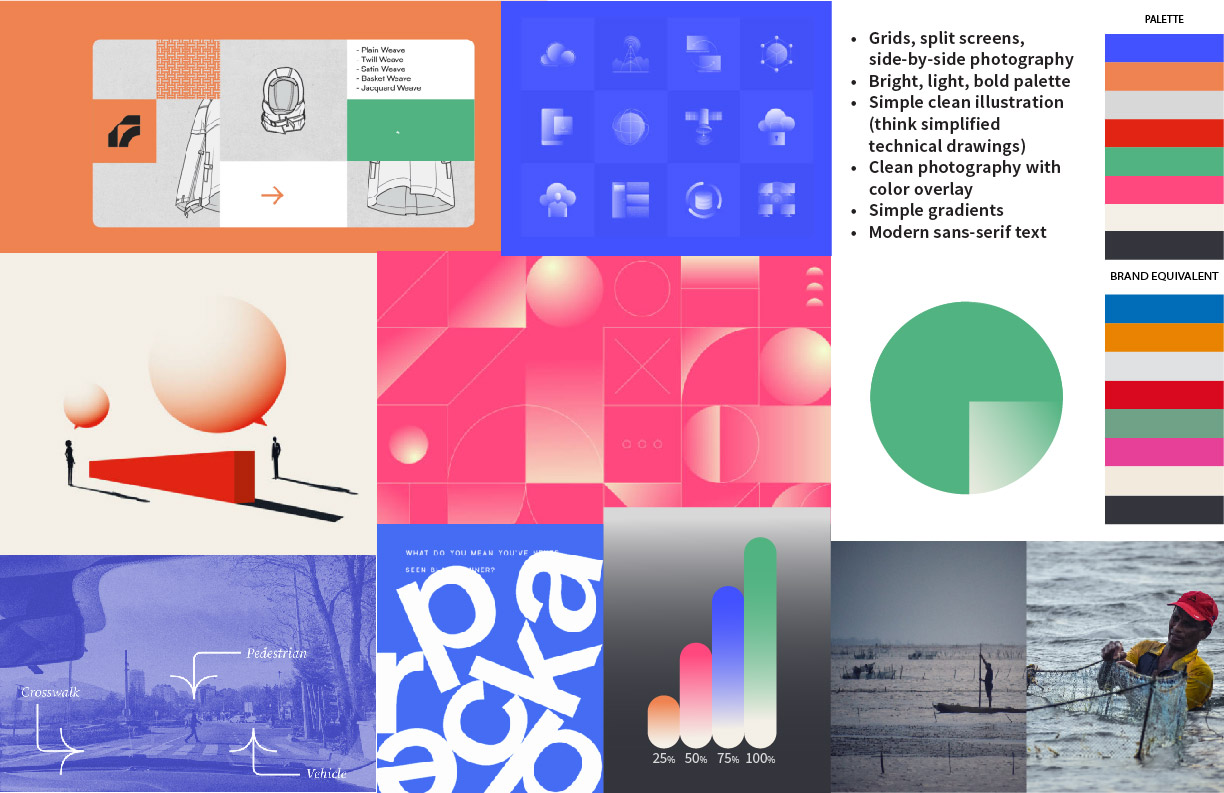
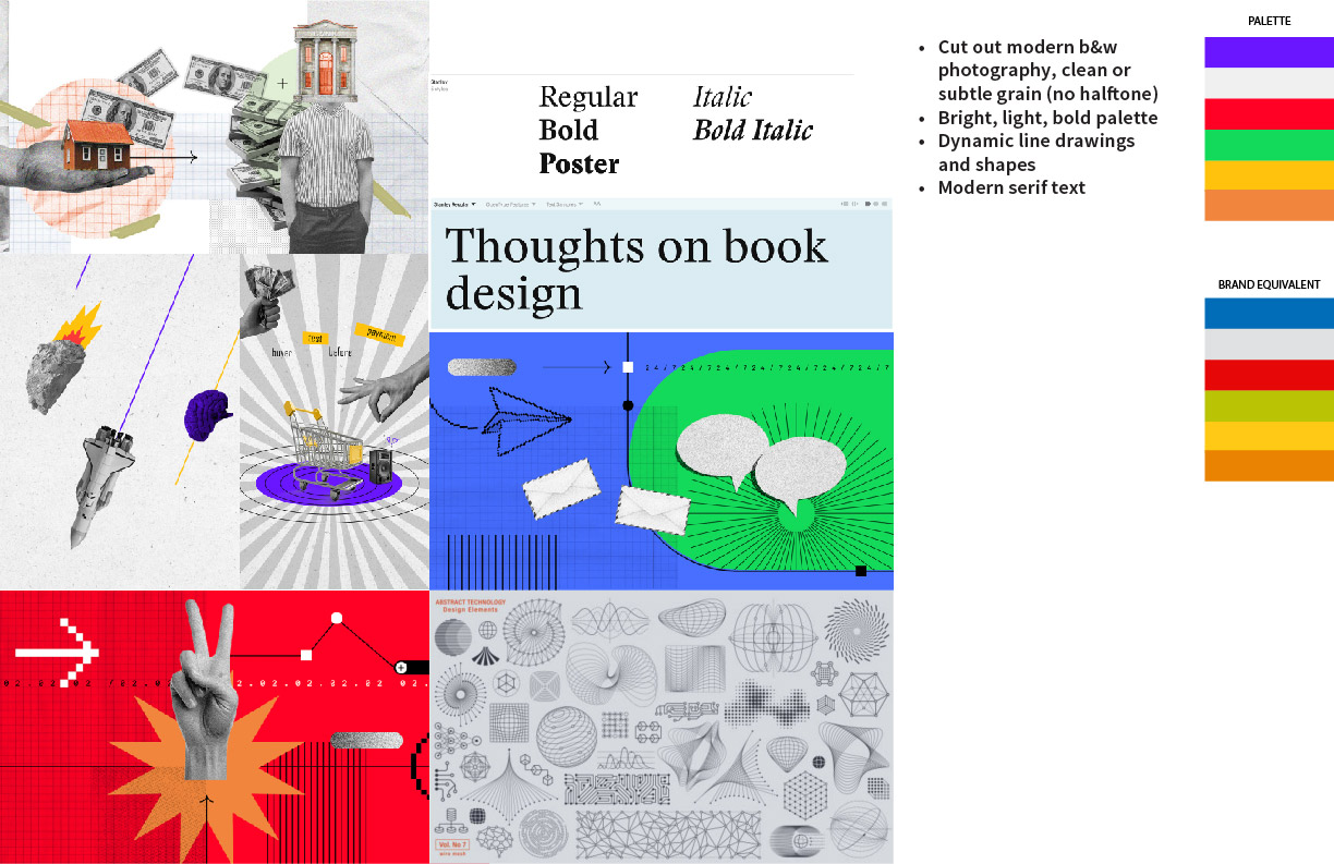
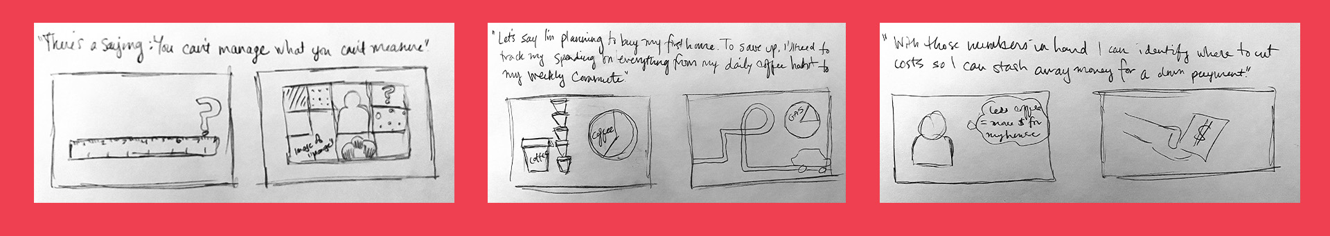
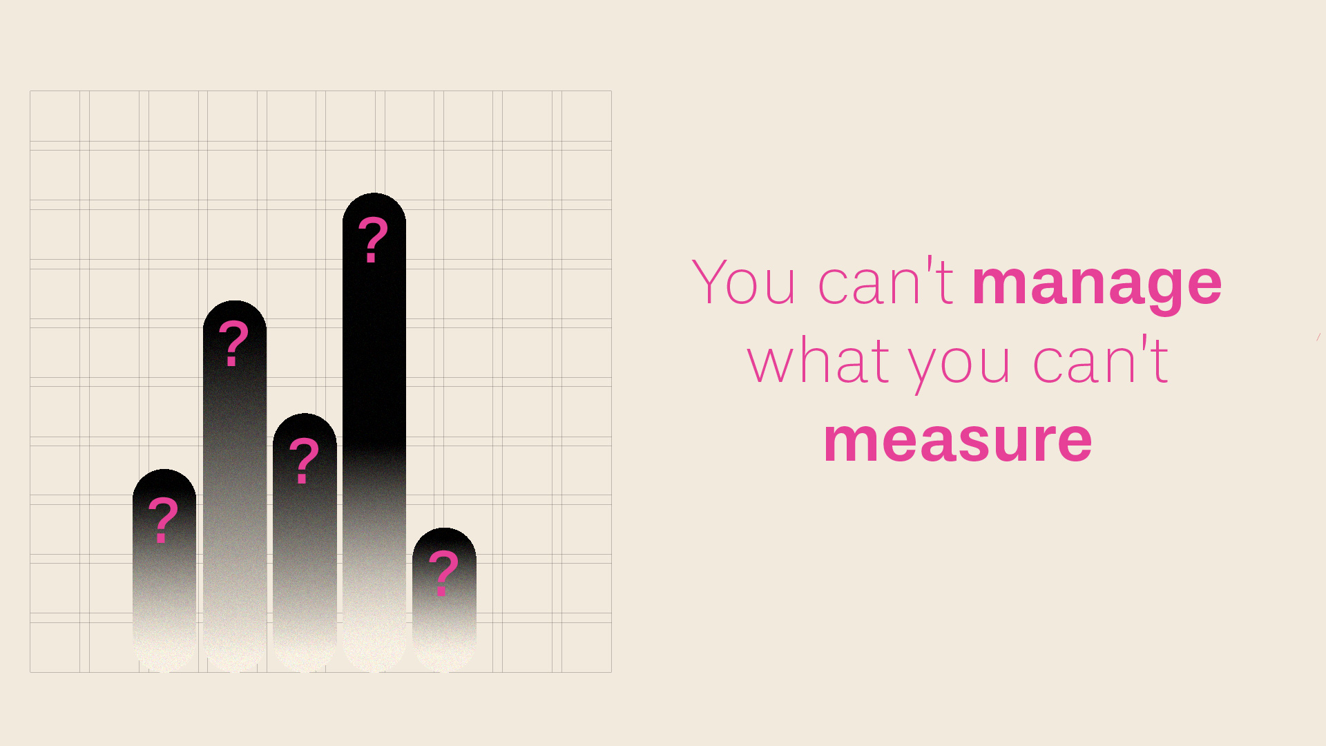
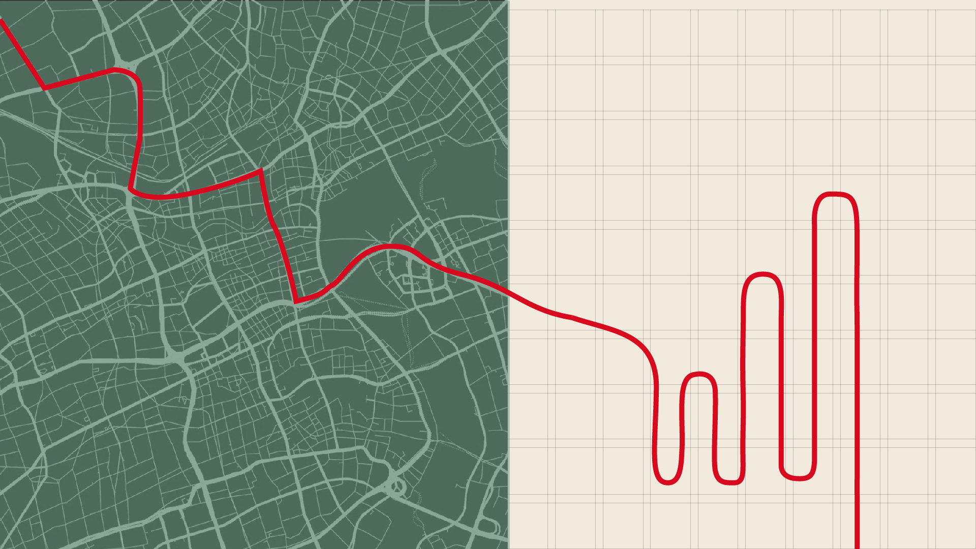
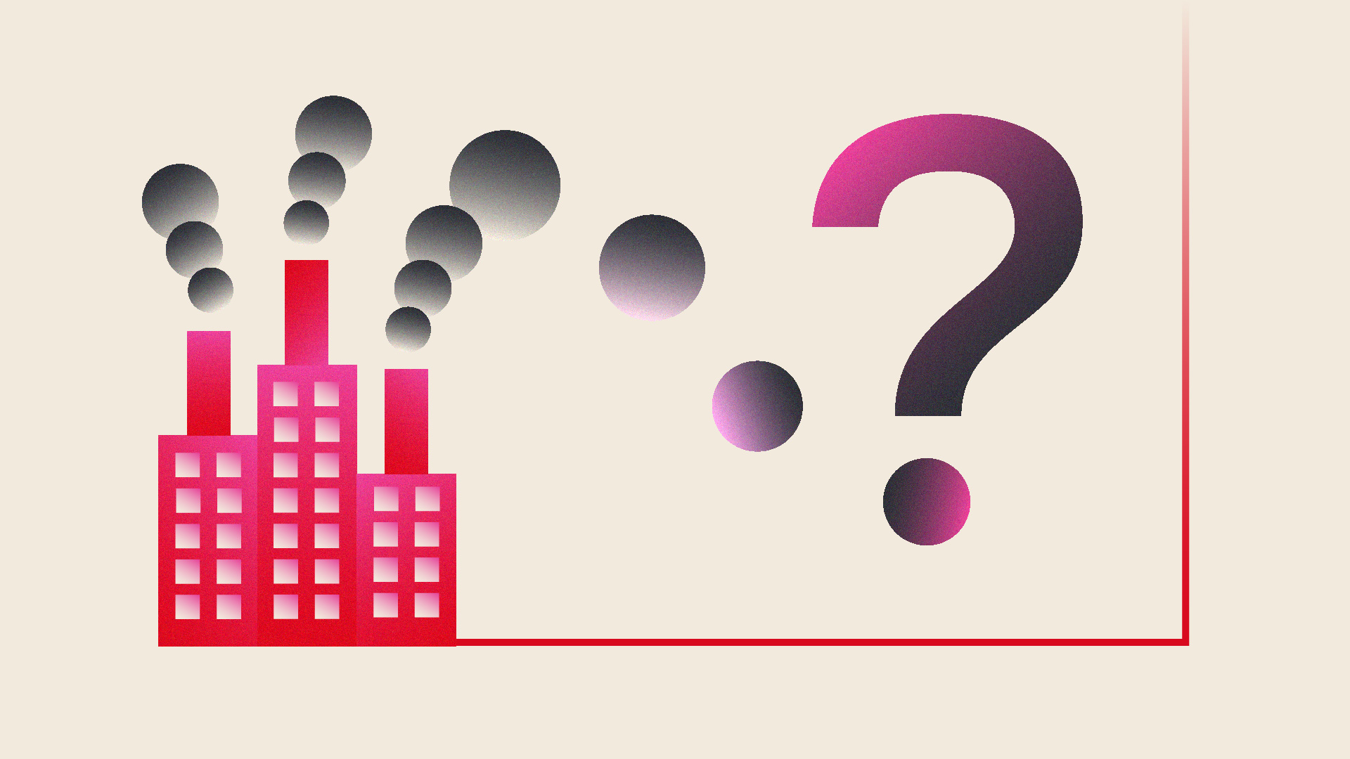
The next step as a team was to narrow each of our mood boards down to one that we thought worked the best and to create a simple storyboard based on a provided script. I went with my first mood board as a jumping off point, using simple shapes and gradients, grids to use when multiple ideas need to be addressed in one screen, and typography that is similar in style to what Stanford GSB typically uses (Source Sans Pro and Source Serif Pro). I went with a color palette that utilizes a balance of neutral and secondary colors from the Stanford GSB brand guide. Below are excerpts of the original sketches and the first rough story board that was used to pitch to the broader communications and marketing team, and the visual style that was ultimately chosen to be used in the Explainer series moving forward.


Watch the series below: