OVERVIEW
I designed an e-book to be used as part of a newsletter survey for Stanford’s Graduate School of Business. It is a collection of Stanford-published articles under the theme of how to “work smarter.”
PROCESS AND DESIGN
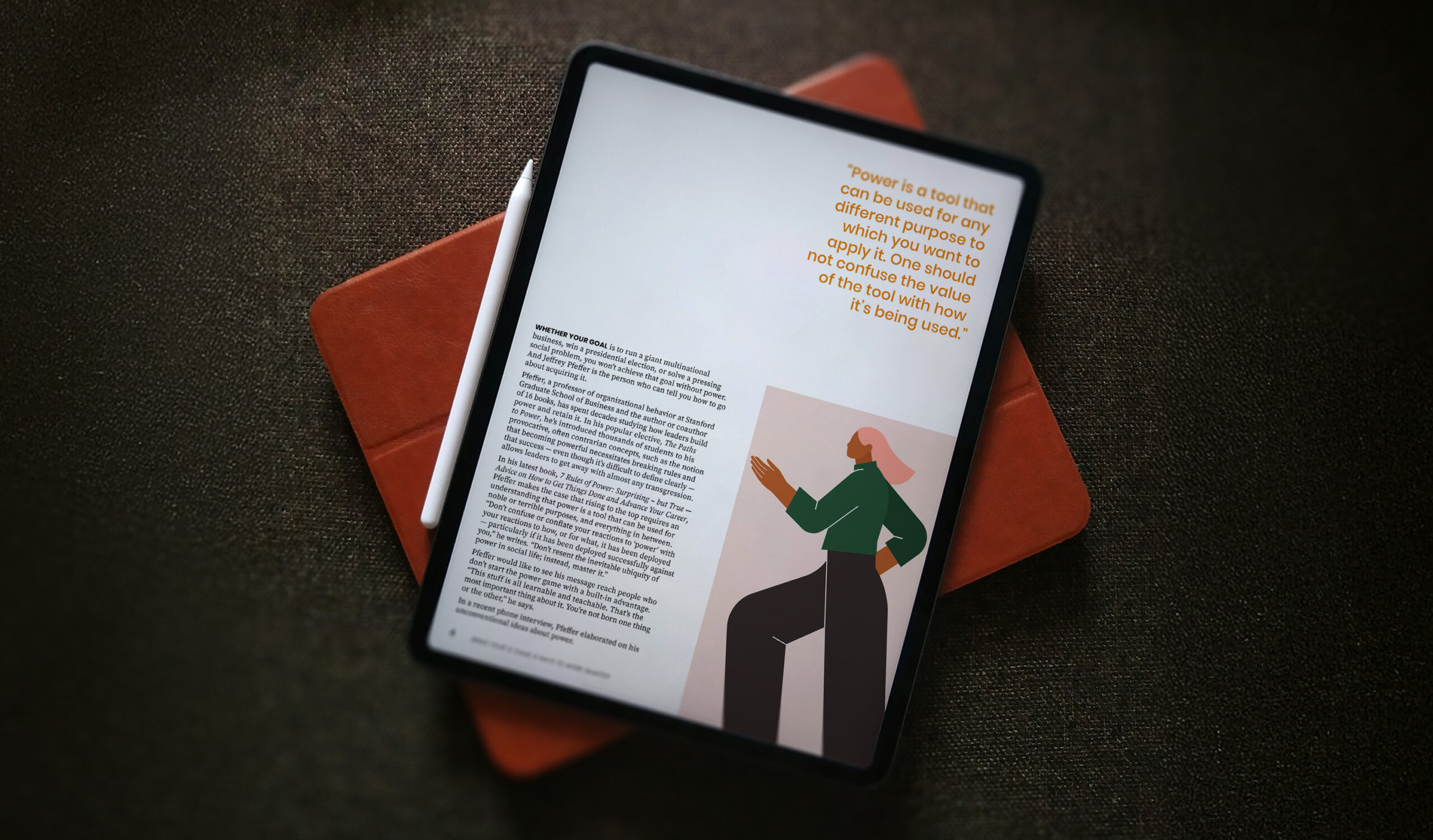
The e-book was designed in InDesign. I wanted to have the look and feel of a magazine while staying true to Stanford Graduate School of Business’ branding guide. I chose Poppins for the title, header, quotes and subhead typeface for it’s friendly readability, and paired it with Source Serif Pro for the body text, a clean but classic serif font. The orange used in the headers, quotes and table of contents numbers is pulled from Stanford GSB’s branding guide. The images, which were used in the original web publications of these articles, were also used throughout each article in a zoomed-in, vignette style to help break up the space and add visual interest. I purposefully left a lot of white space on each page to give the eye a place to rest and improve readability. I also followed a formula for the layout of each article; there is a title page with the subhead and image, body pages with at least one pull-quote, and at least one page in each article contains a vignette-image pulled from the key image.