



OVERVIEW
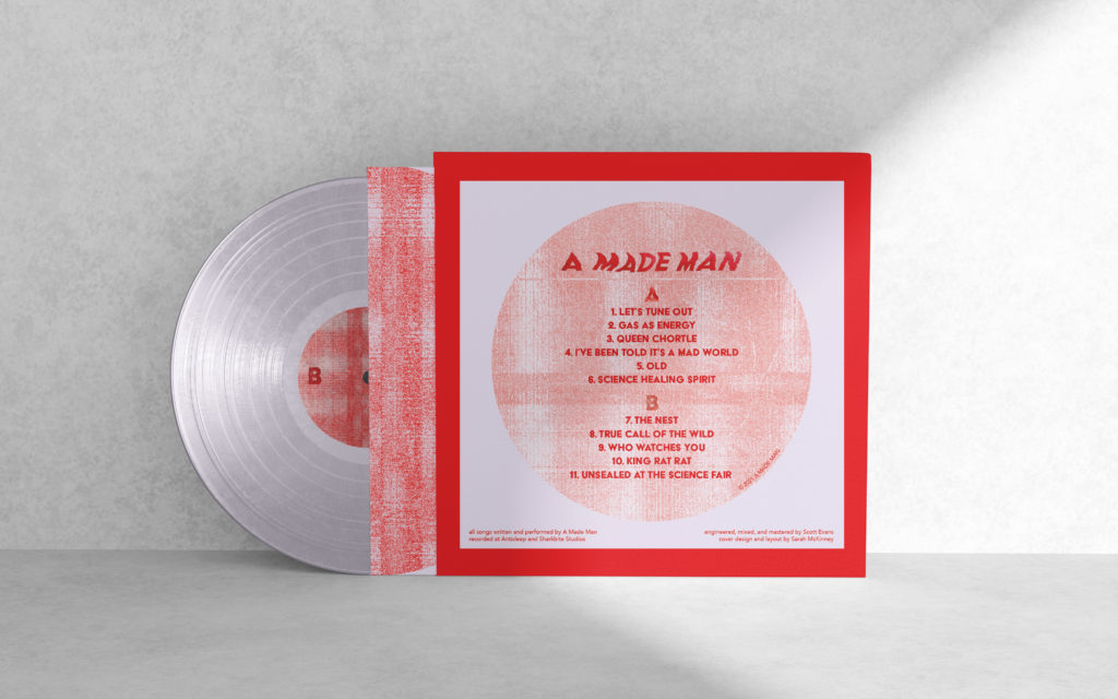
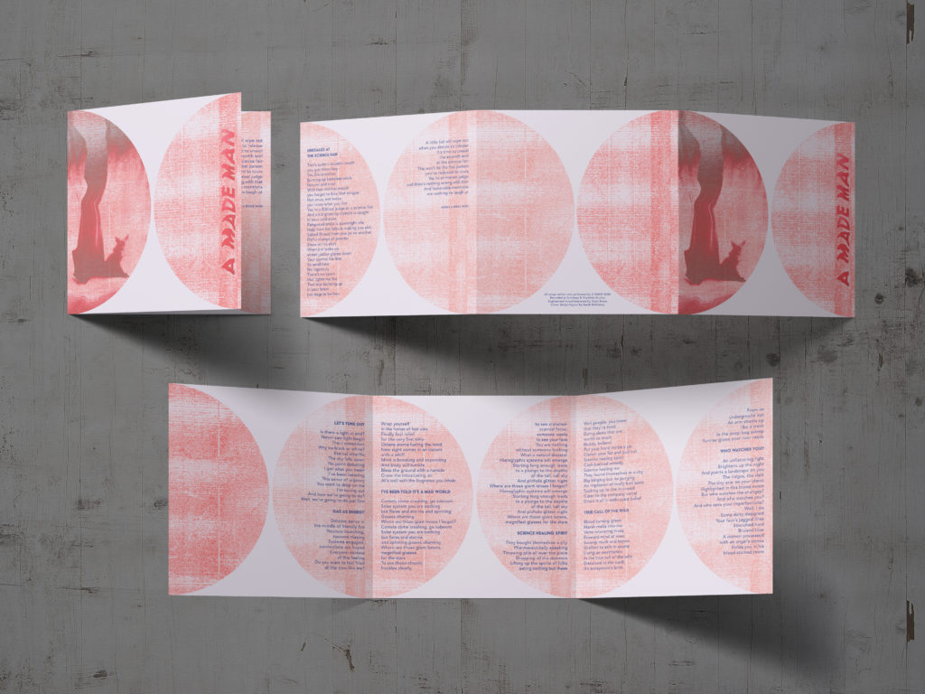
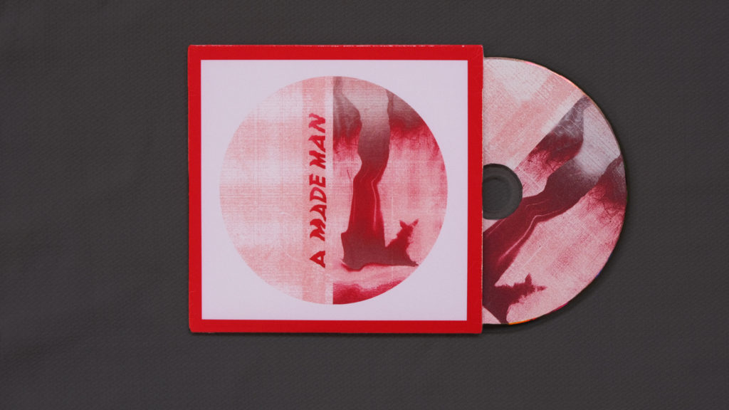
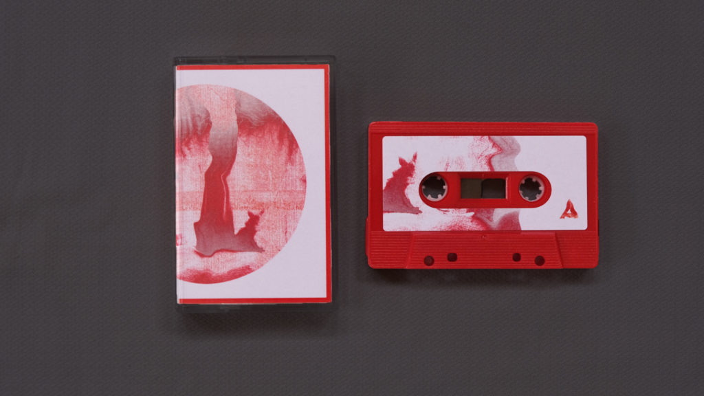
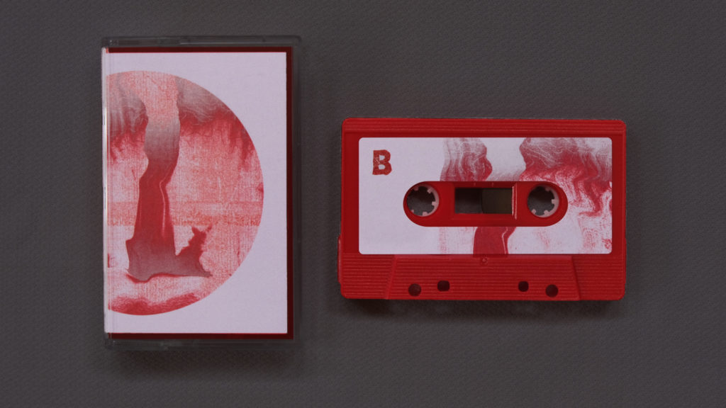
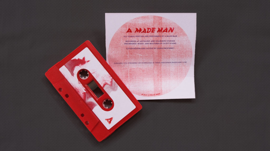
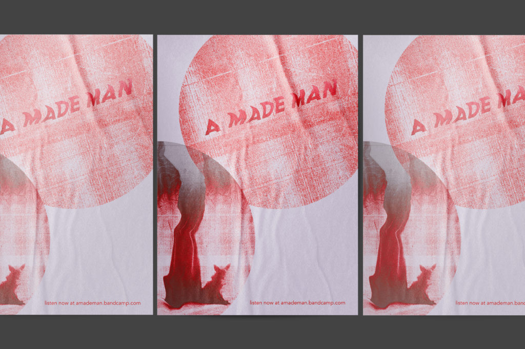
A Made Man is a solo musician who put out a self-titled album and was looking for packaging design and branding for a vinyl record with lyric book, cassette, CD, and promotional poster.
…
PROCESS
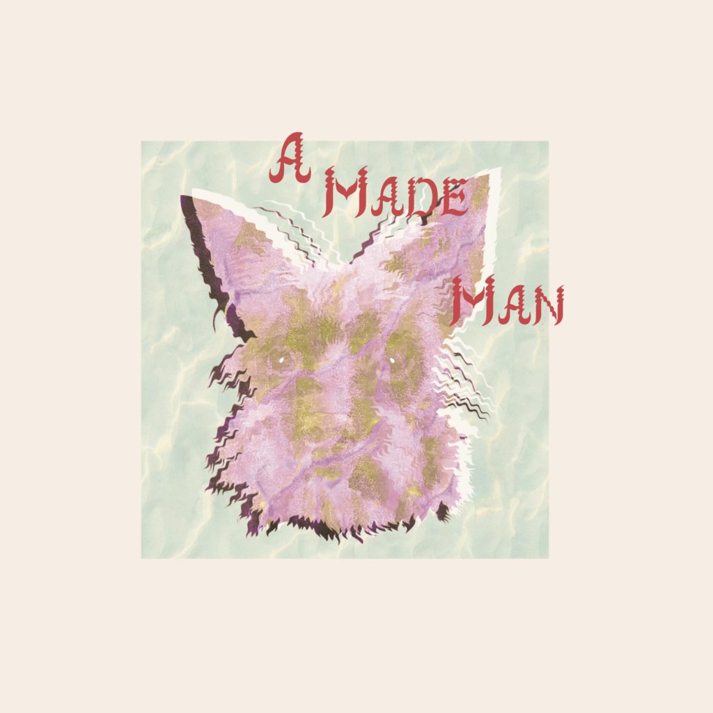
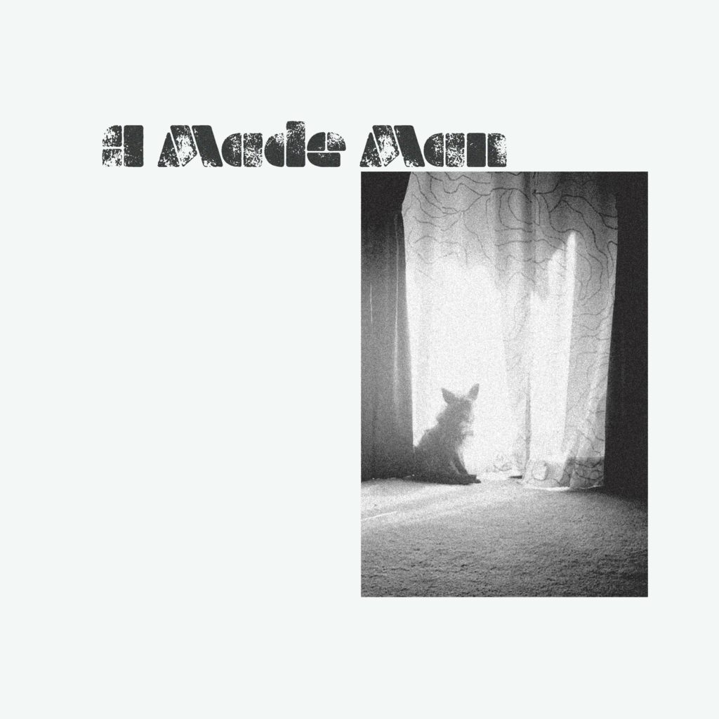
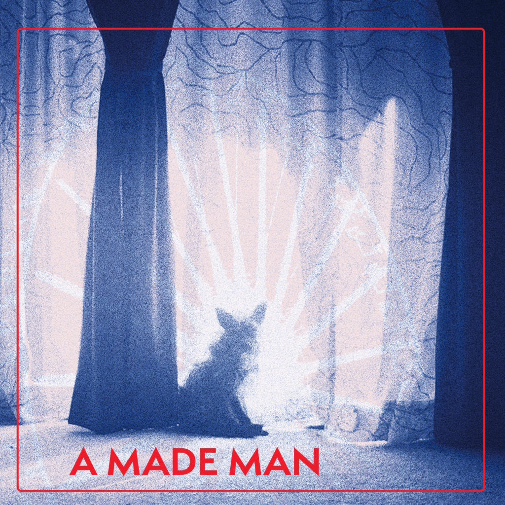
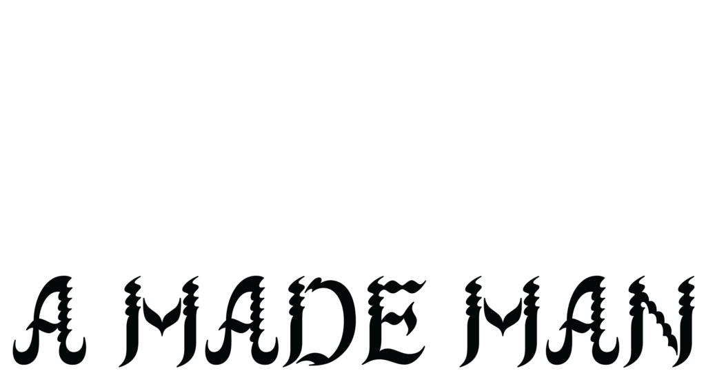
A Made Man had an image that he wanted to use of his dog, but he didn’t want it to be recognized as a straightforward photograph of his dog. The challenge was to manipulate the image in a way that was visually interesting while still somewhat recognizable as a dog, that would also incorporate colors and textures that emoted the themes of the record. I started by narrowing the typography down to three type treatments that I thought would complement the record, image and name of the band using AGNamsangjun, Milka Aged and Semplicita Pro. Once the client had chosen the best fit for typography (Semplicita Pro), I worked on incorporating textures and colors that would work with the typography and mocked those up for review. The client went with the third choice above for the first revision.
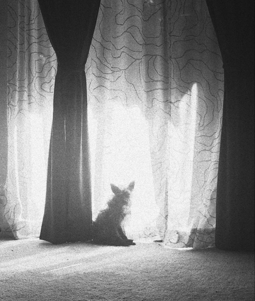
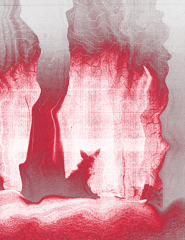
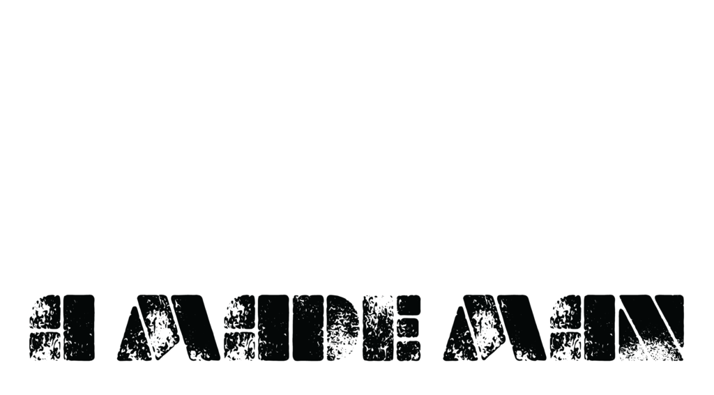
I wanted to treat the type and the imagery with a distorted photocopy texture to give it a “live,” textural feel. Using photoshop, and just two colors to keep with the simple “photocopier” look, I distorted the image until it and the type looked like they had been run through a broken photocopier several times.

Final type treatment
TYPOGRAPHY
The final typeface chosen for the title was Semplicita Pro Bold, manipulated to look distorted. For the song titles we used Acier Bat, which has similarities to Semplicita. The credits and song lyrics are in Avenir.

