

OVERVIEW
The challenge was to create a conceptual ad campaign by inserting a modern product into classical paintings to create a juxtaposition between product and surroundings. The product must look as if it were painted into the original painting.


PROCESS
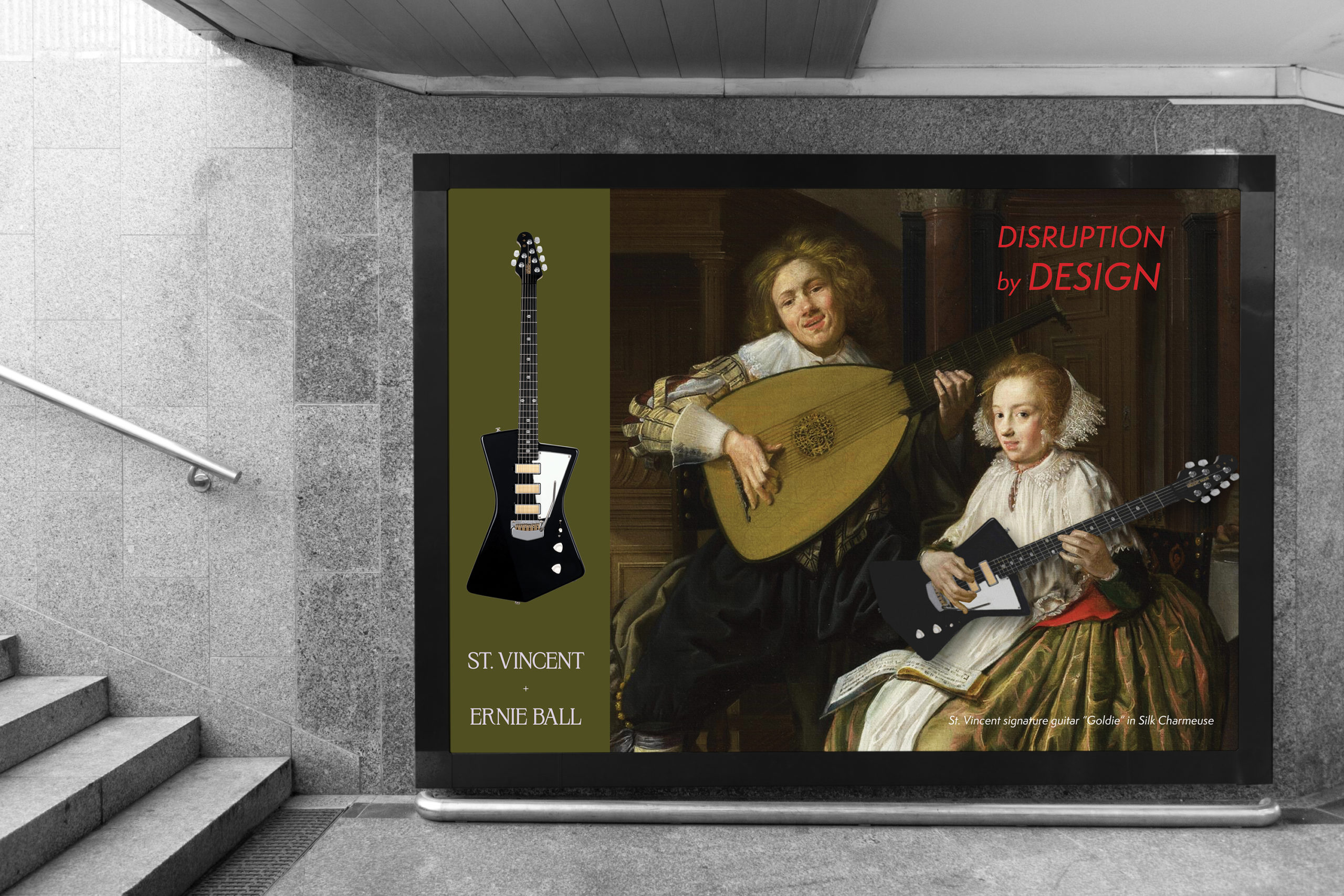
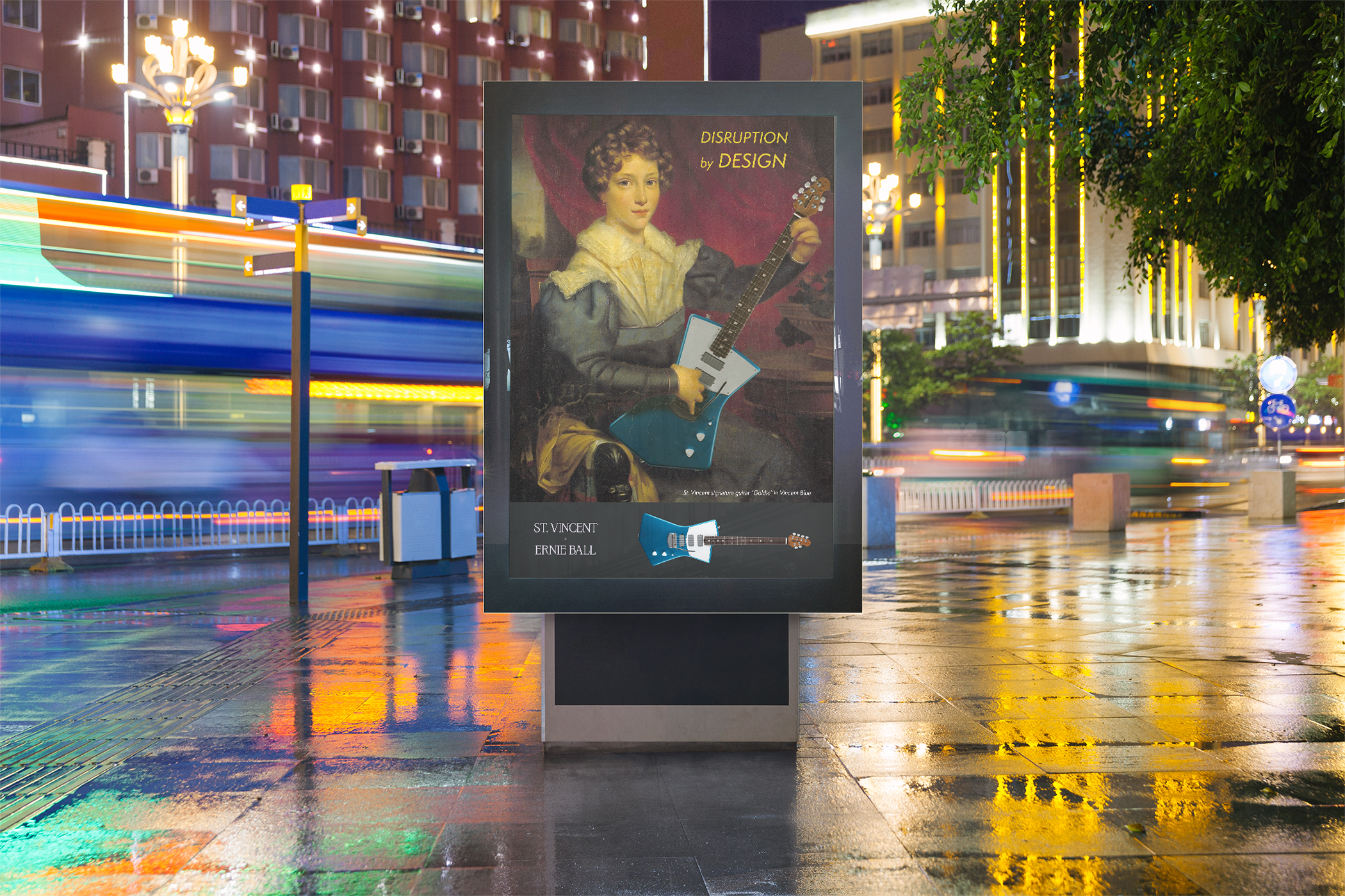
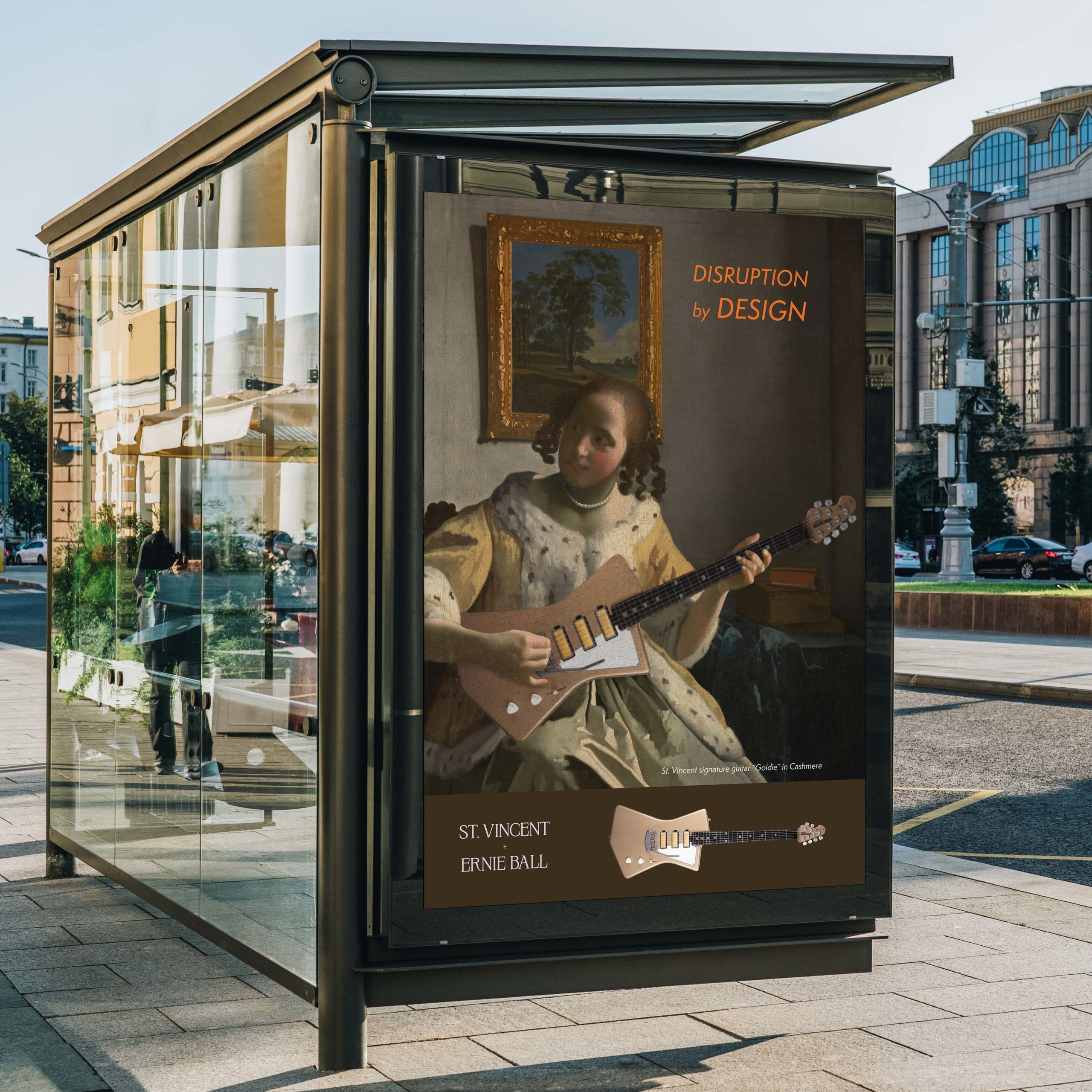
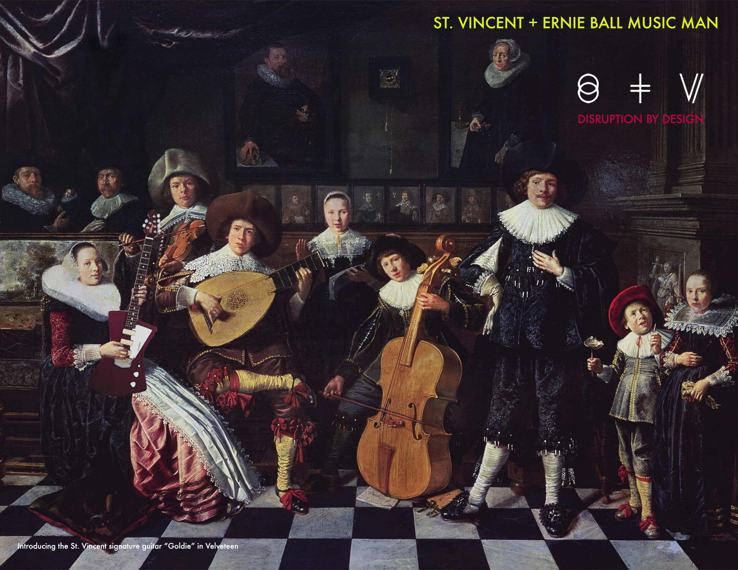
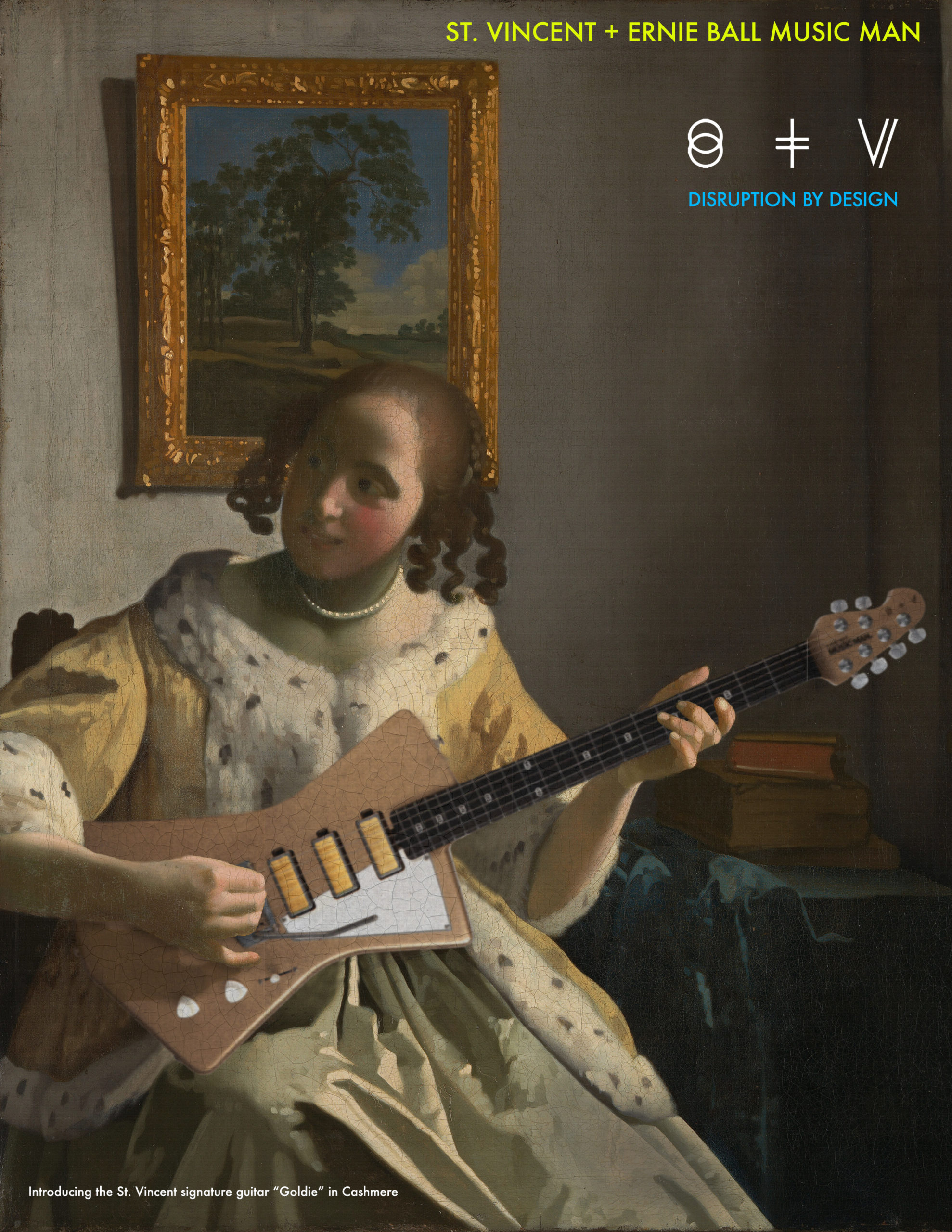
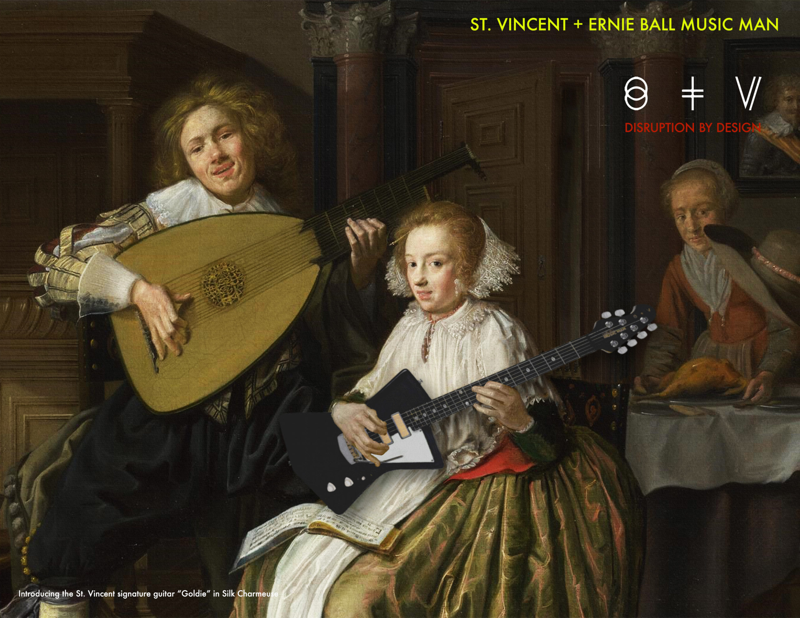
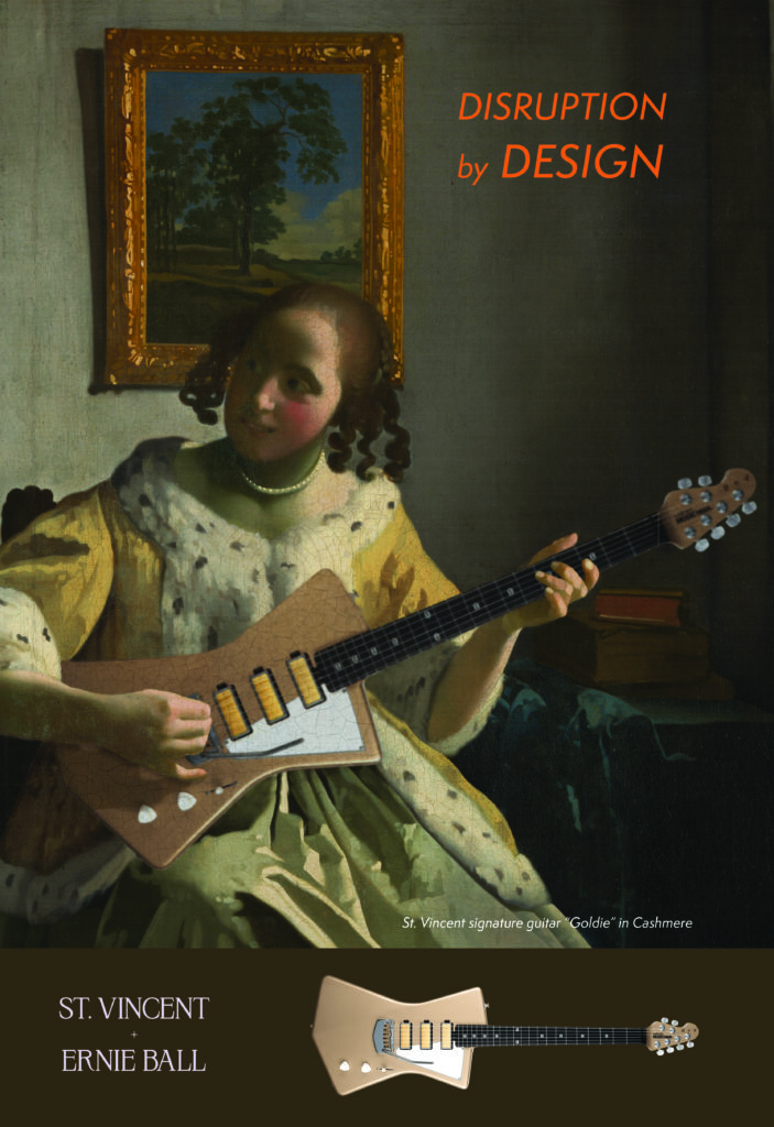
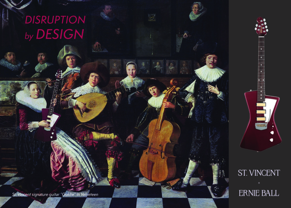
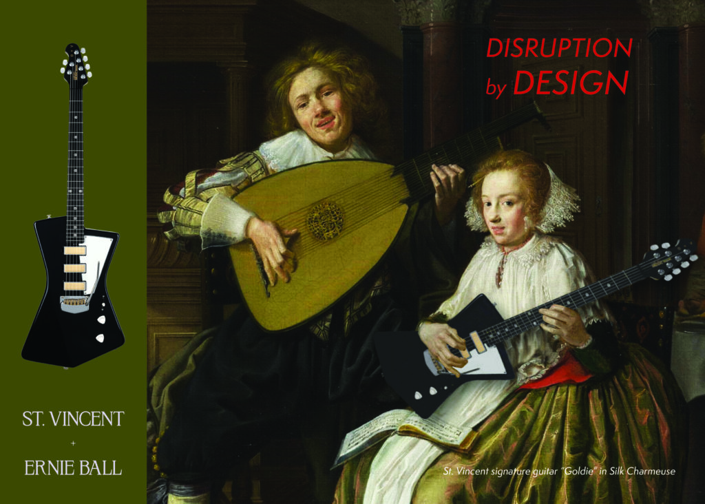
I chose the St. Vincent + Ernie Ball Goldie Guitar as my product of choice. I started by choosing three paintings that featured women playing guitar or lute to aid in the composite process. I then downloaded PNGs of the guitar in varied colors. Through masking, layers, and effects I inserted the PNG’s of the guitars into the paintings.
I went through a few variations of typography and branding. I started with a version that used Futura Medium and featured bright bold colors for the branding and tagline. It also featured the St. Vincent logo.
After review, I felt that the tagline was too small, that the St. Vincent logo was superfluous, and that the ad should feature an un-manipulated version of the guitar so that the consumer can see what it actually looks like. I also felt that the typography should be varied between branding and title/tagline.
TYPOGRAPHY AND BRANDING
I added a solid color section where the guitar could be featured, and changed the typography to Semplicita Pro Italic for the tagline and Krylon for the title. I changed the colors of the text to be more neutral, with the exception of the taglines which are based on a more saturated version of a color in the painting. I also expanded the campaign to have two vertical options, and two horizontal options.

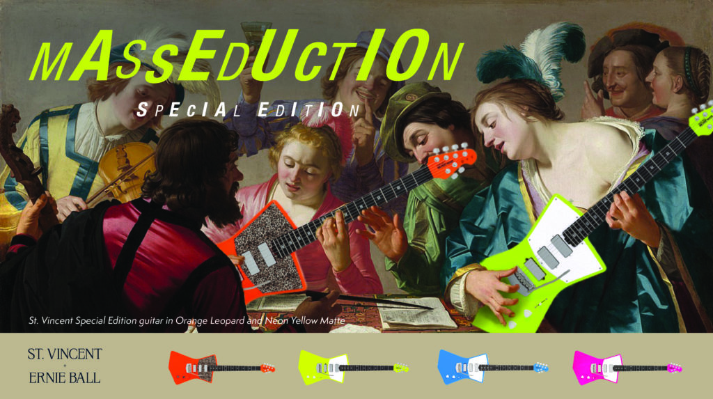
I created a 5th variation for a separate ad campaign for the new St. Vincent + Ernie Ball Masseducation guitar. For this campaign I used the same typeface (Krylon) for the the branding, but I used the actual Masseducation design from the Ernie Ball website for the title/tagline. The colors chosen were done so with the same rules in mind as the other campaign.