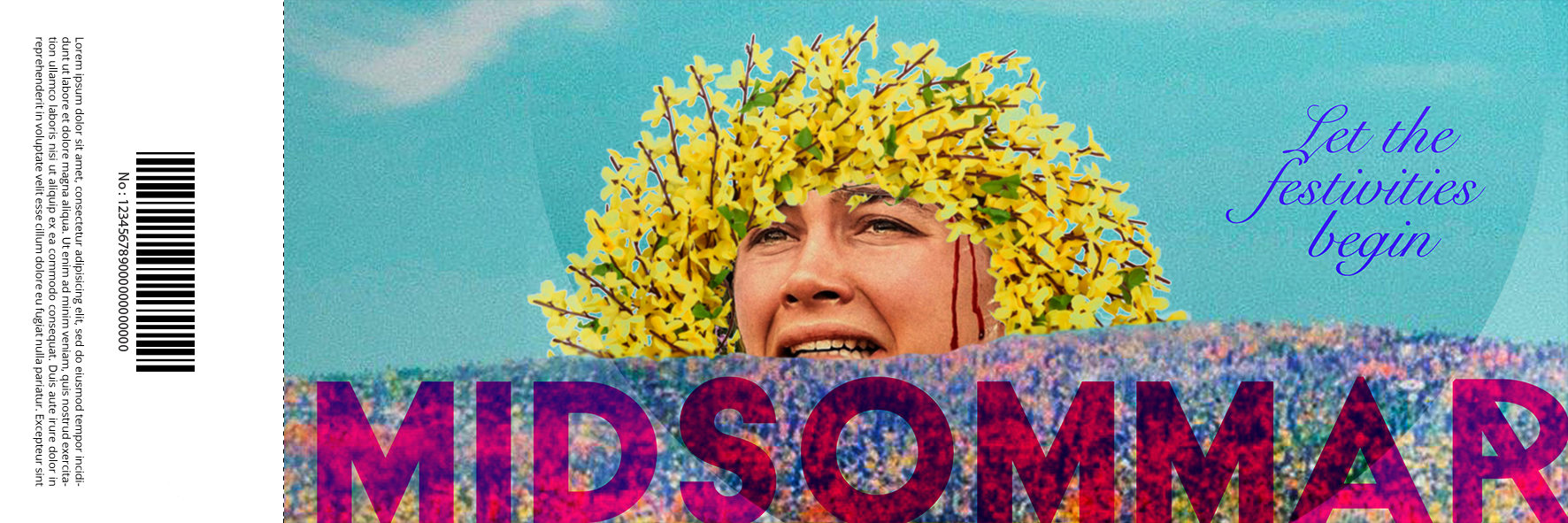
OVERVIEW
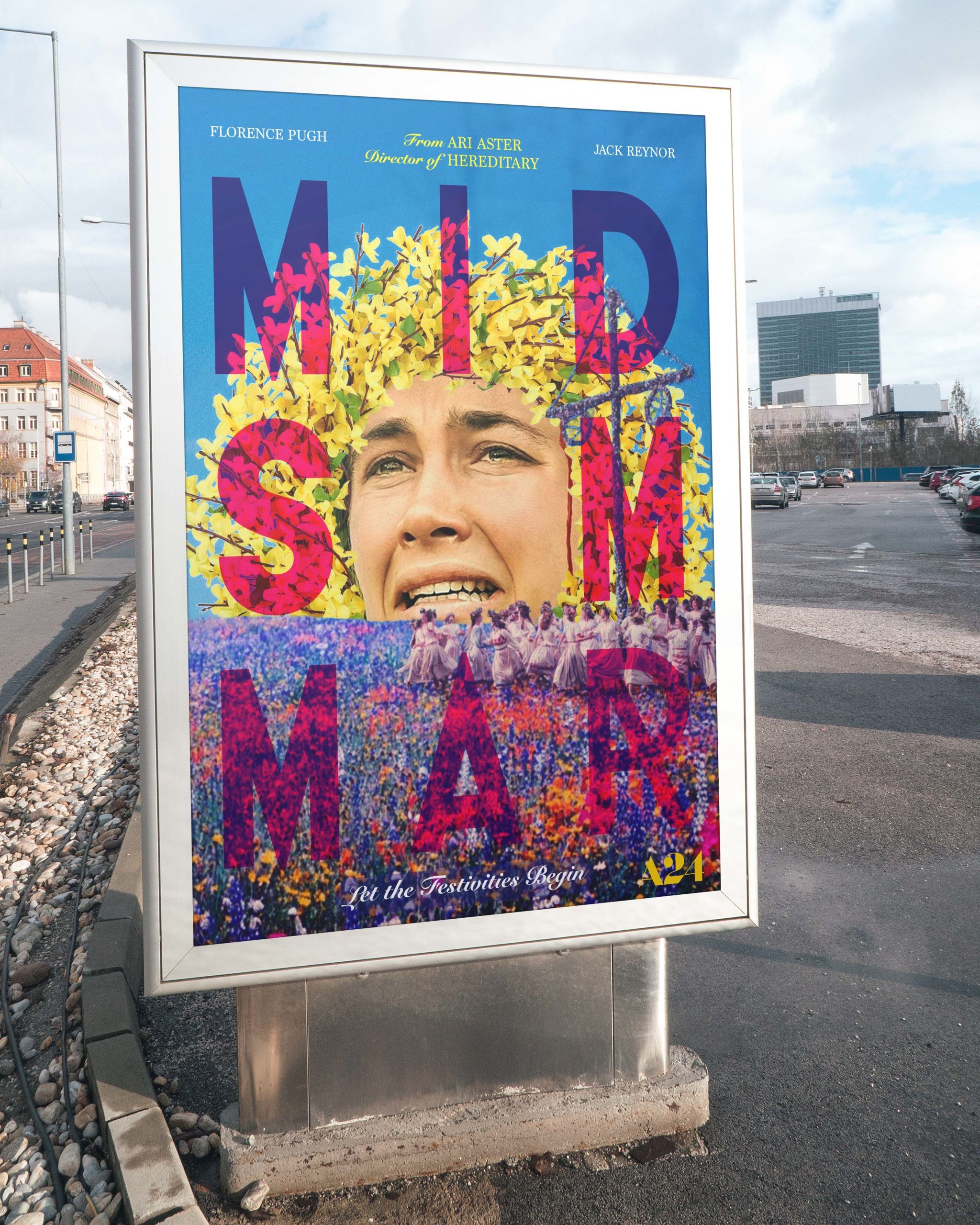
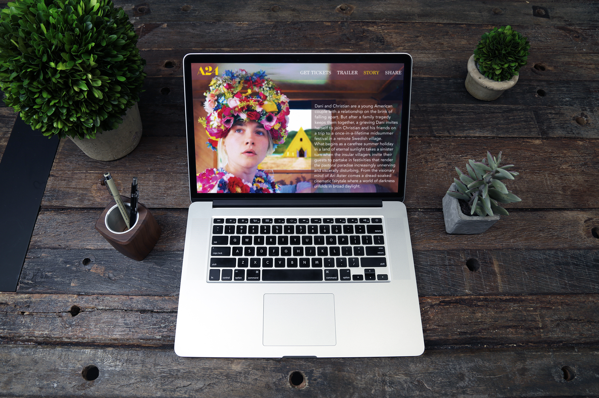
The purpose of this project is to create a conceptual advertising campaign of print collateral along with a website and mobile application where audiences can find out more about the movie, where to buy tickets, and see a preview.
TYPOGRAPHY & BRANDING
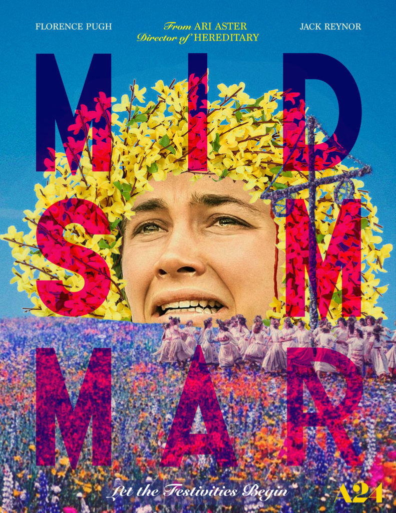
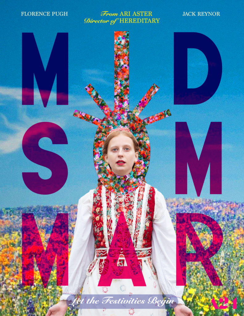
I chose a color palette that is almost psychedelic or surreal (bright and blown out) to capture some of the mood of the movie. There is repeated use of yellow, which figures prominently throughout the film. The title uses a typeface called Acier BAT, which was chosen because of its geometric, bold qualities, and a typeface called Format 1452 that was used only on the “R” of Midsummer. This was done because the stylized R of that particular typeface. I wanted it to have the feel of something “witchy” like a rune, to evoke some of the dark symbolism from the movie, offsetting the bright color palette. The supporting text uses Snell Roundhand and Marion.
DIGITAL
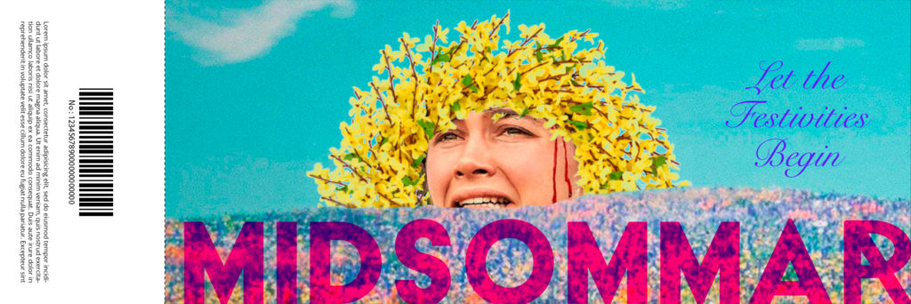
The website features imagery from both posters for continuity. I used Adobe Photoshop to combine images that are from the movie but that typically aren’t actually seen together in the the movie. I employed layer masks and other effects to combine them effectively. Typefaces used are the same as the posters with the addition of Avenir for the body text on the STORY page.


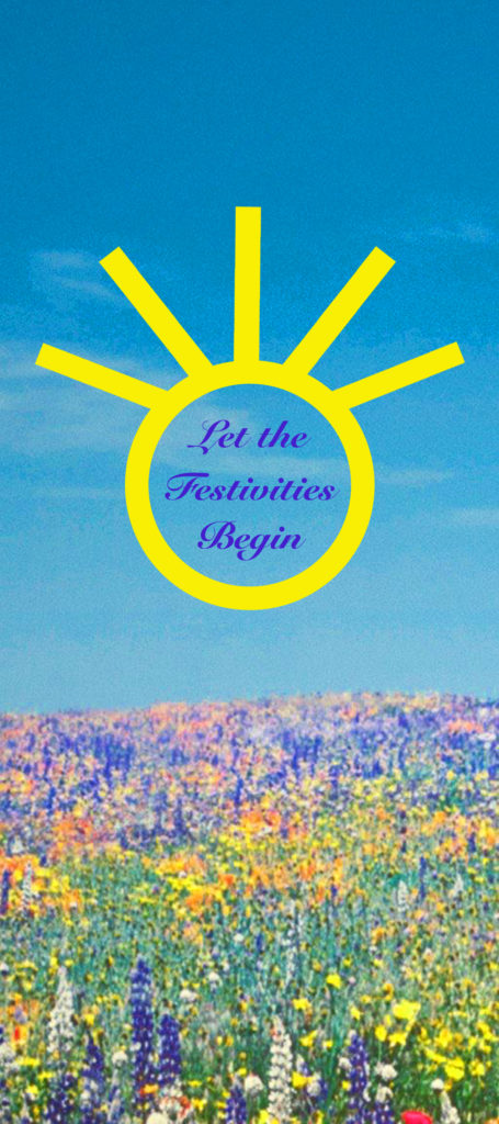
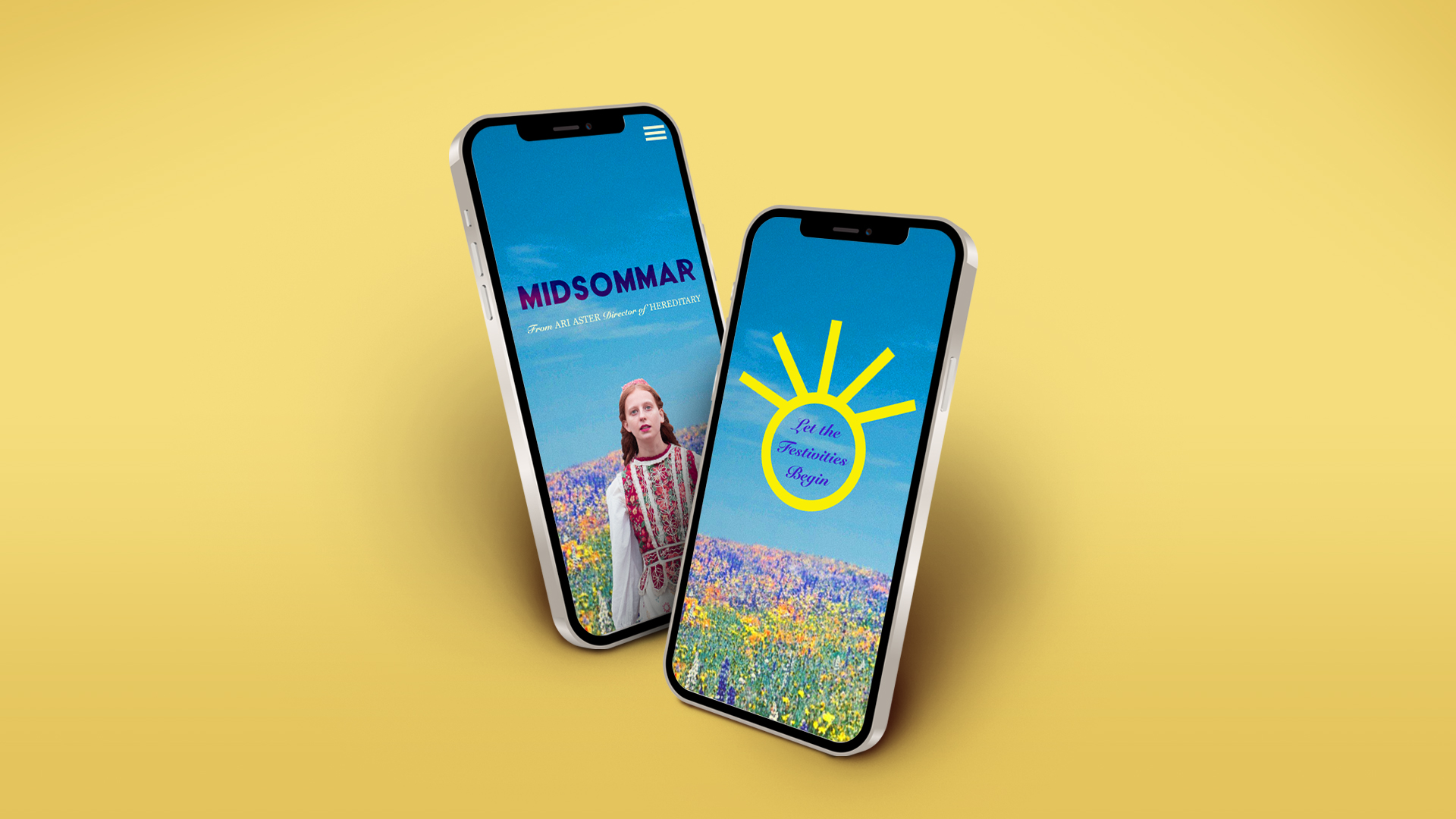
The mobile version of the website has a landing page with an interactive button asking the user to “Let the Festivities Begin.” This opens up to the menu selection page where the user can select the desired page from the dropdown menu.
