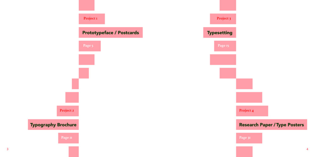
OVERVIEW
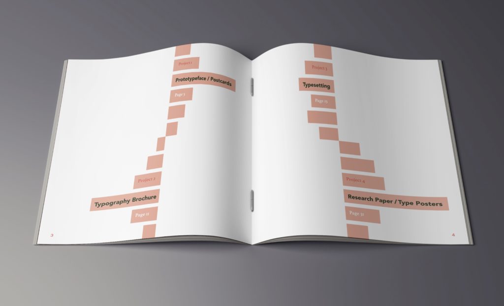
The challenge was to design a book that serves as a collection of different typographic assignments: A prototype typeface and postcard to highlight it, a typography pamphlet that explores the anatomy of a typeface, typesetting exercises, a research poster on a Swiss designer, and a set of type classification posters.
PROCESS
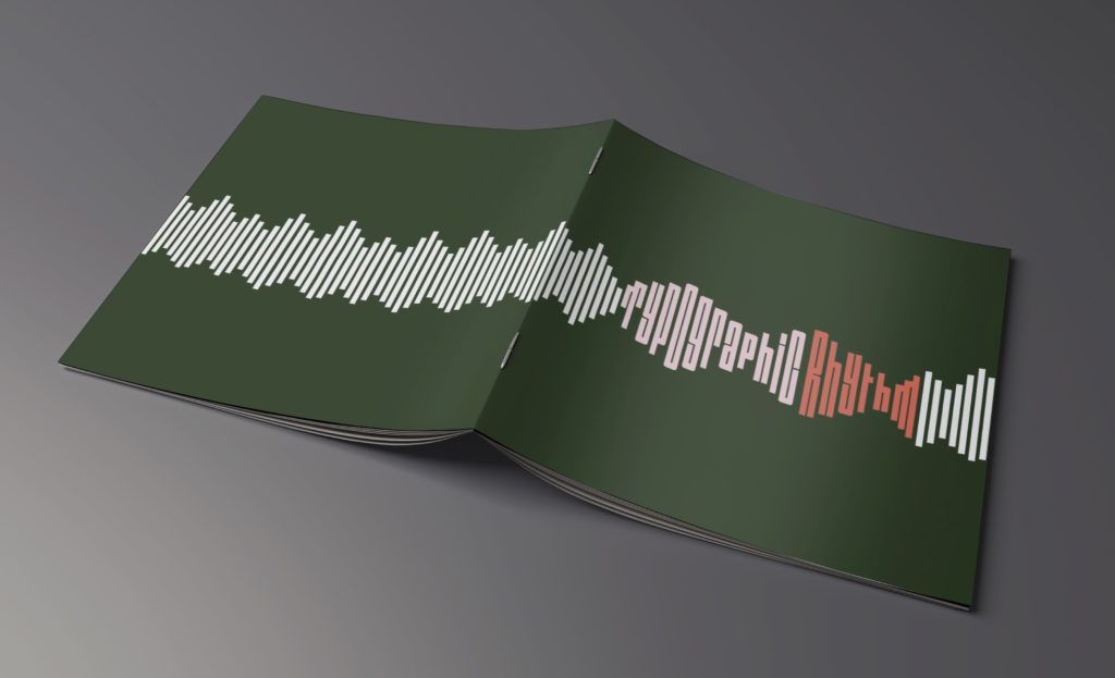
I started with the idea to center my book around sound and rhythm, since typography and the written word is often described in this way. I explored, through thumbnail sketches, different visual ideas of “sound.” I ended on a sound wave design that incorporates the words “Typographic Rhythm” into the sound wave design for the cover, and the overall theme.


DESIGN & TYPOGRAPHY
The imagery of the sound waves, along with the colors used on the cover, are echoed throughout the book for a cohesive design. In most cases of this I dropped the opacity of the colors down to about 15% so as not to distract from the work that was being showcased. I used a dark green for the main cover color, and chose light pink for the word “Typographic” and orange for the word “Rhythm” to separate the two. The sound wave bars are in a very light grey, and continue onto the back cover. The color combination elicits a “retro” vibe that pairs well with the title typeface. The words “Typographic Rhythm” were manipulated from the typeface Outward Block, which has a very condensed look with crossbars and strokes that are aligned in a very severe vertical way. This typeface lends itself well to making it look like it is part of the sound bars surrounding it. Inside the book the quote typefaces used are Contralto Big Demi Bold and Regular, Bebas Neue Book and Athelas Bold, and the copy typefaces are Avenir Black, Medium, Book, Book Oblique, Light Oblique and Athelas Regular.

CONTENTS
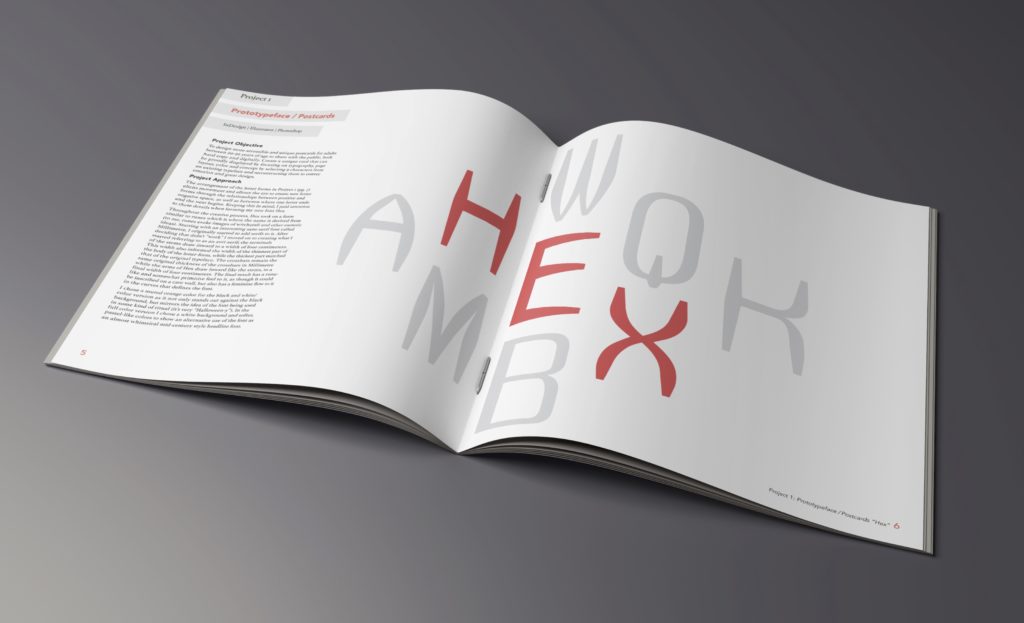
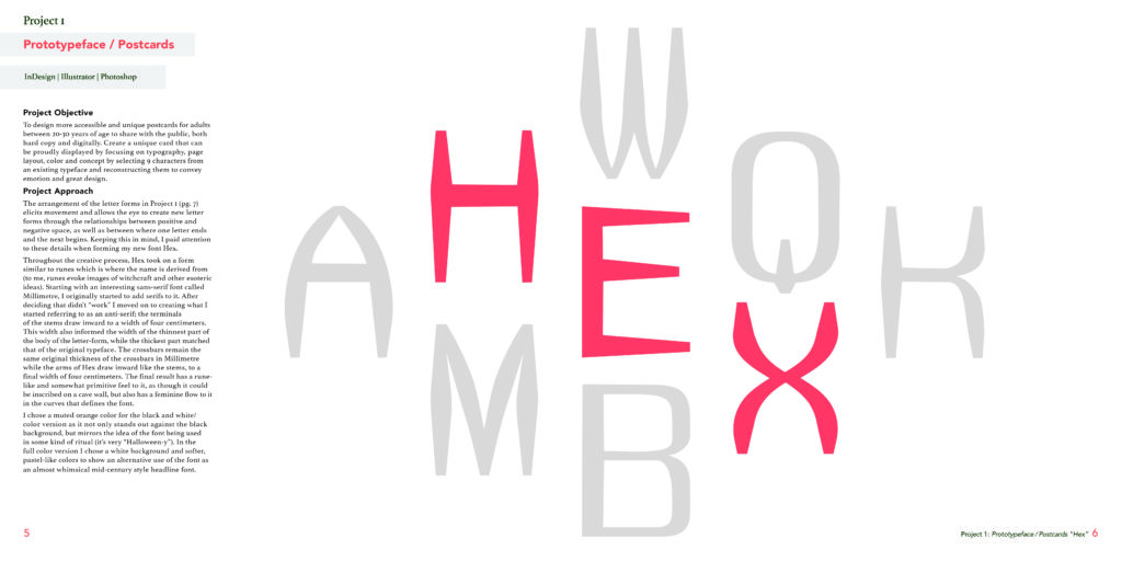
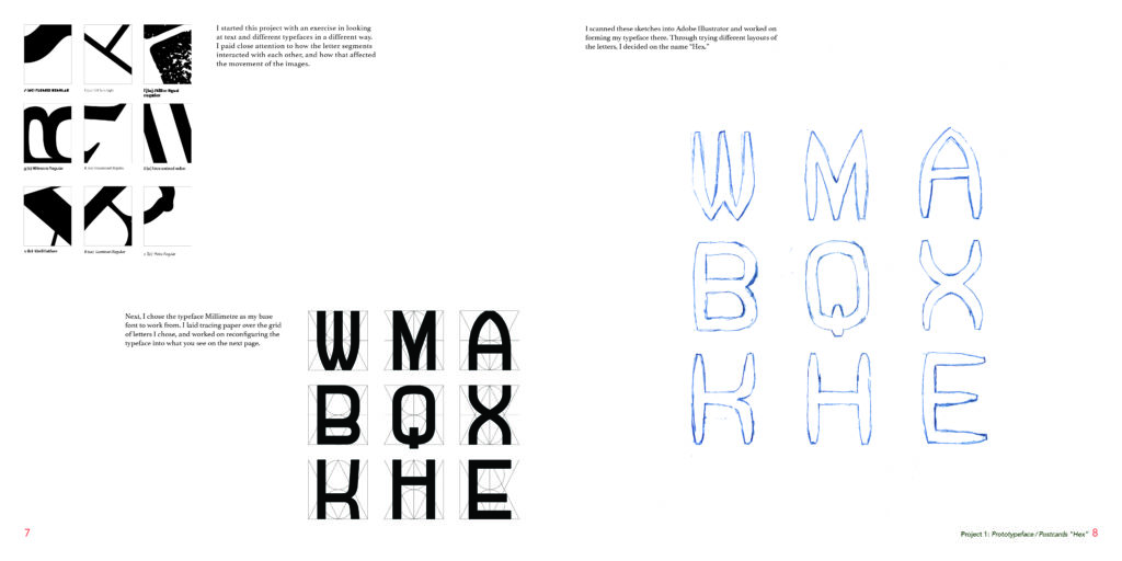
The first project highlighted in the book is a “prototypeface” that I created called Hex. The process is explained in the spreads. The final portion of this project was to create a series of postcards that would highlight the typeface. I chose to create a hero image for each spread. In this particular spread, the typeface itself is the hero image. It spans across both pages, with the gutter going between the A-H-M and the remaining letters falling on the right page.


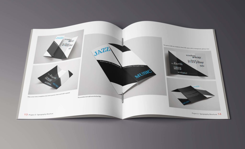
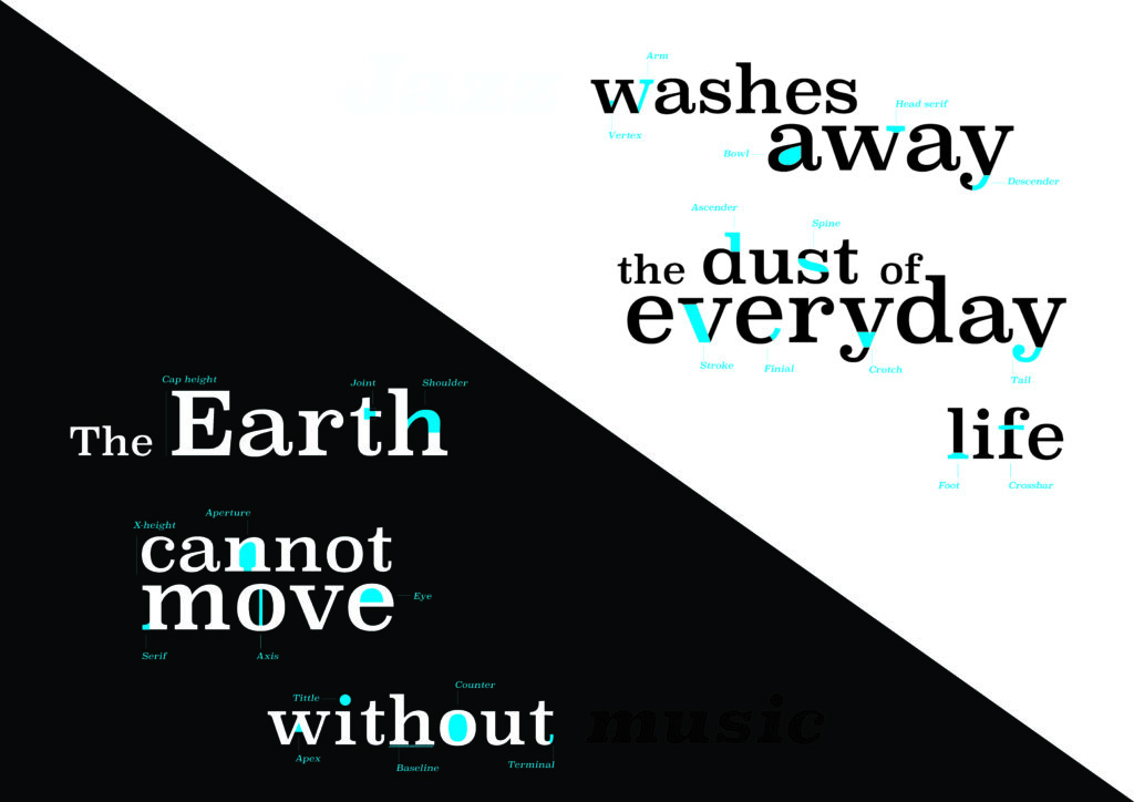
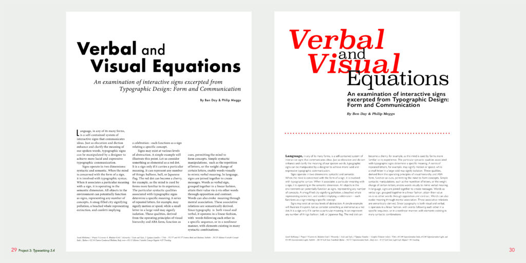
The second project featured is a brochure that explains the anatomy of the typeface Clarendon. The challenge was to show the main image of the brochure, shown below in the hero image, in addition to showing how the brochure is laid out. The main image of the second spread spans the gutter, so I made that the largest image to ensure that it is still readable.


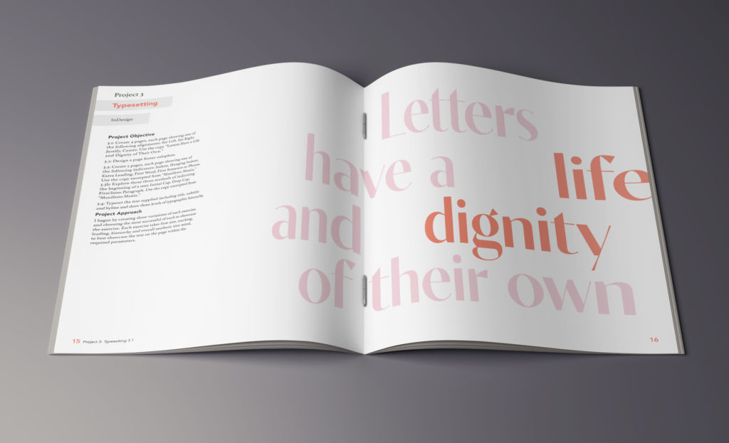
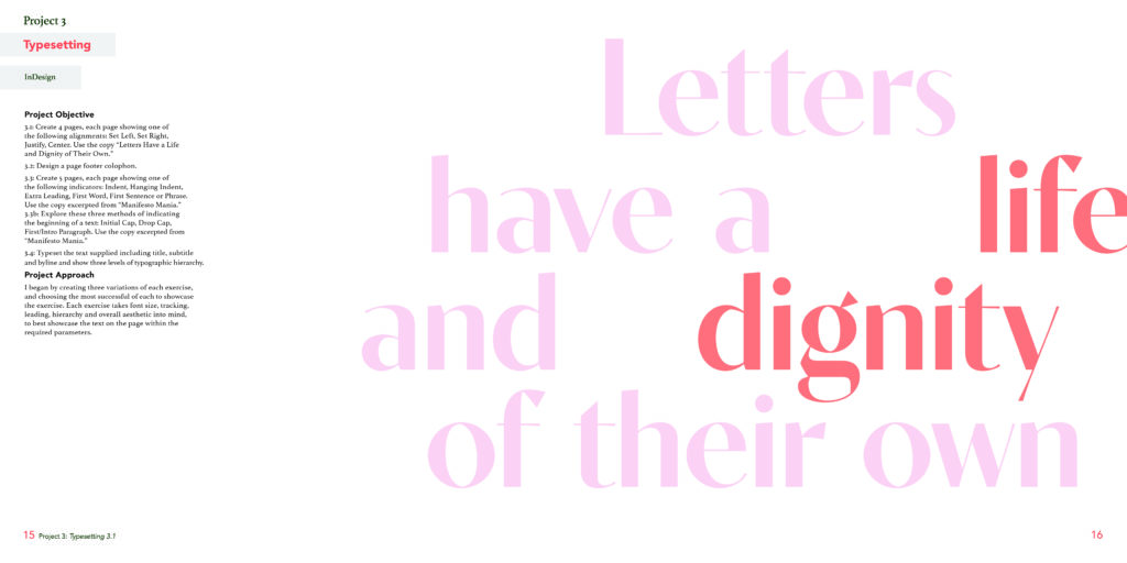
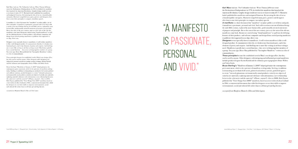
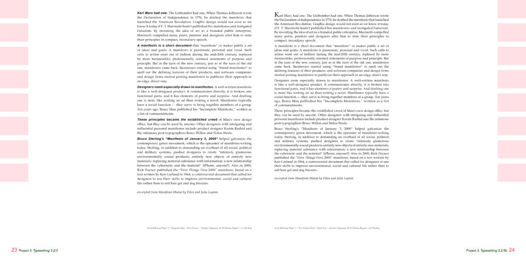
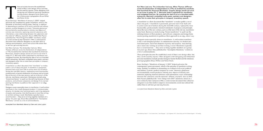
The next project was a series of typesetting exercises. The challenge was to lay out the text in an interesting way that didn’t overwhelm the page, and that highlighted the blocks of type in a clean way. I used pull quotes on most pages to create visual interest. On pages where there wasn’t a title or pull quote, I used elements from the cover that echo the shapes of the rags of the typesetting exercises.


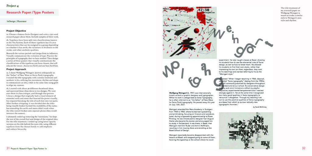
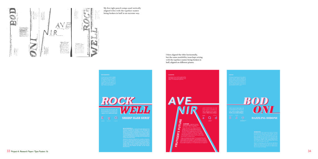
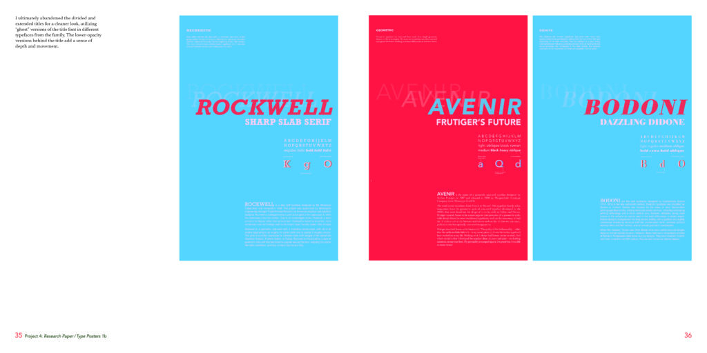
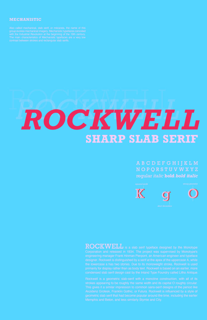
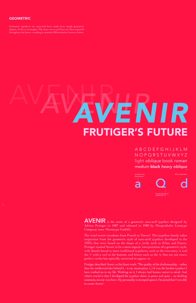
The last two projects are a research paper/poster on a Swiss designer (I chose Wolfgang Weingart) and a series of type classification posters. The type classification posters show the design process and final versions of the posters.